Case Study
Case Study
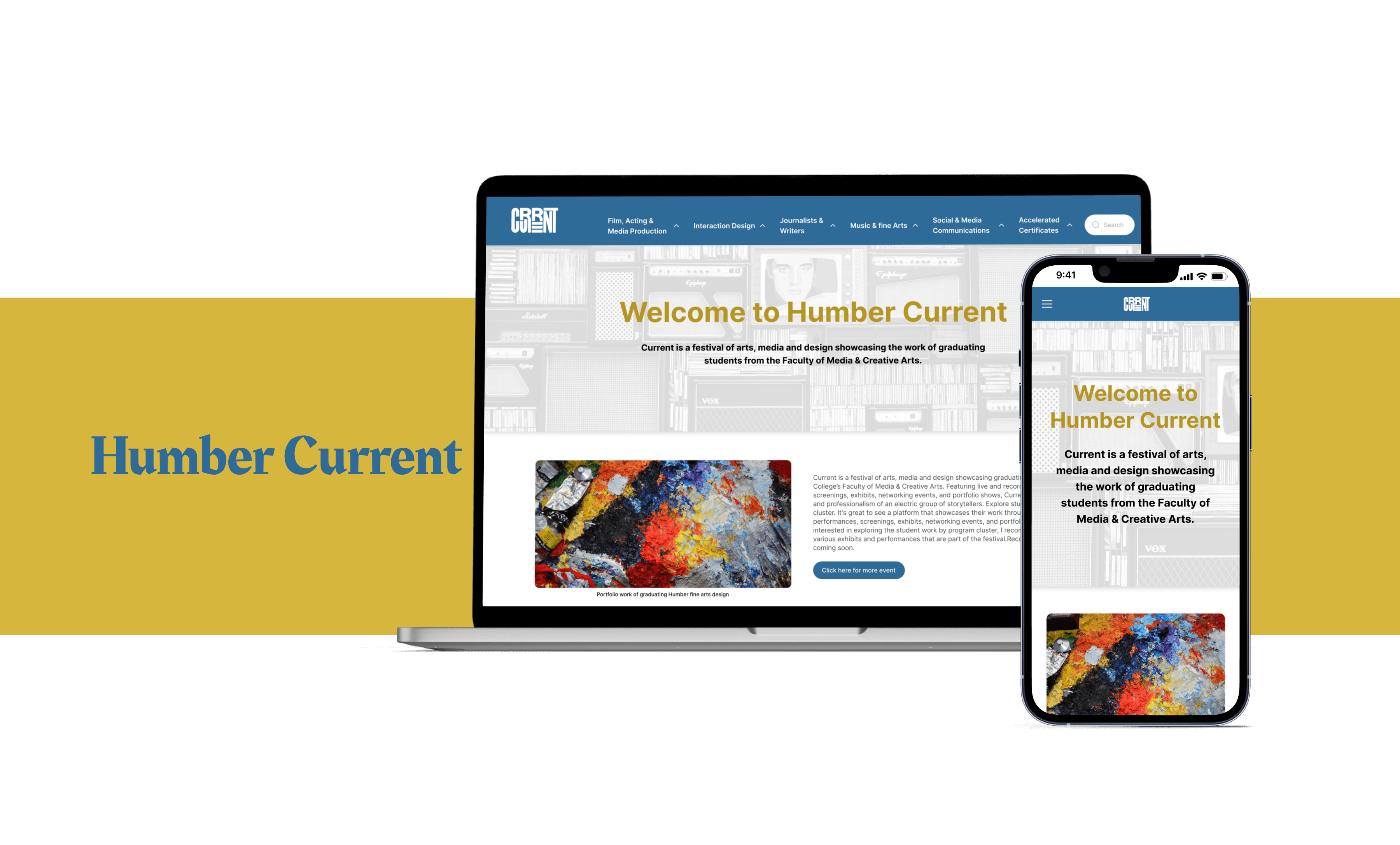
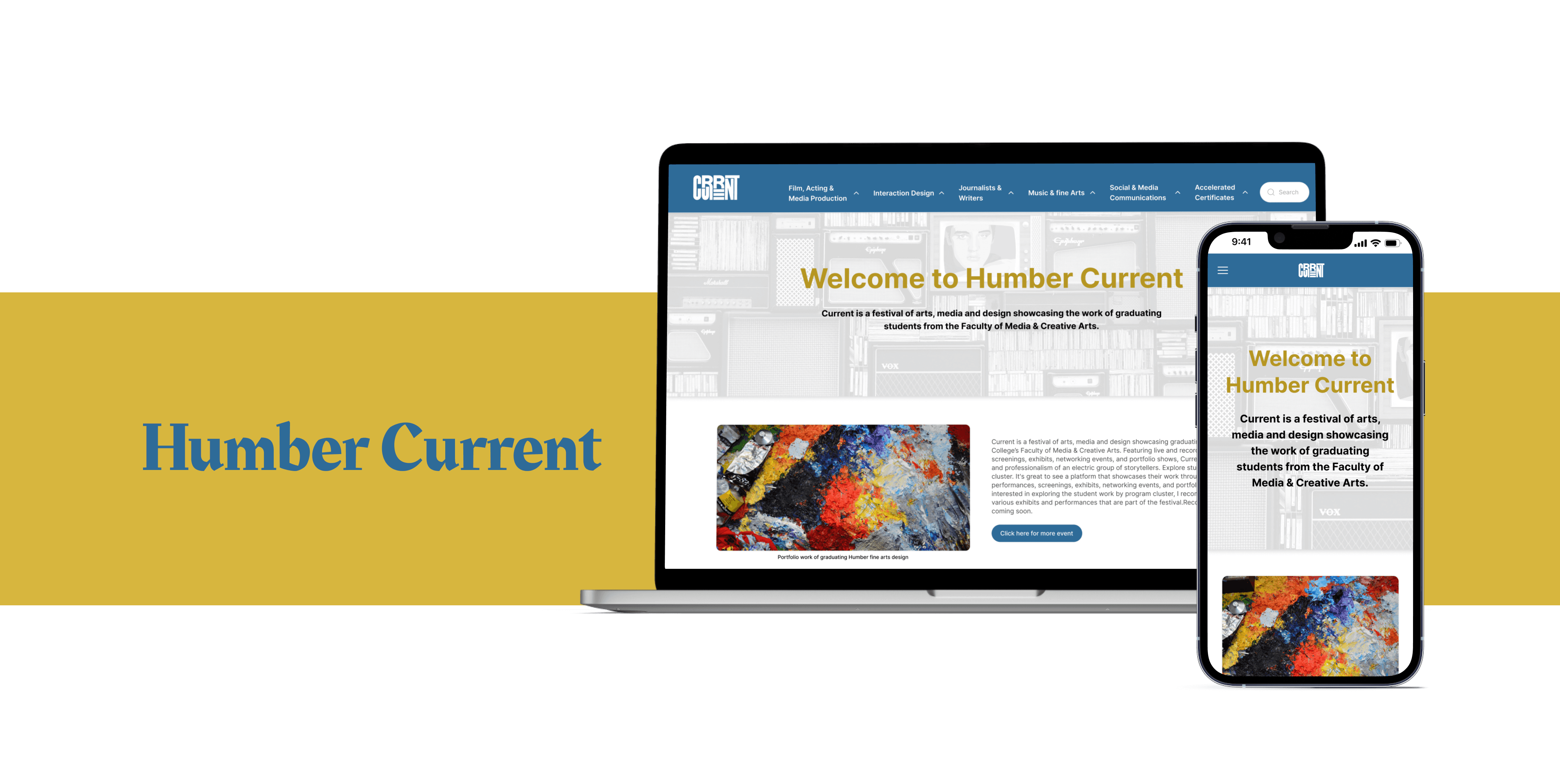
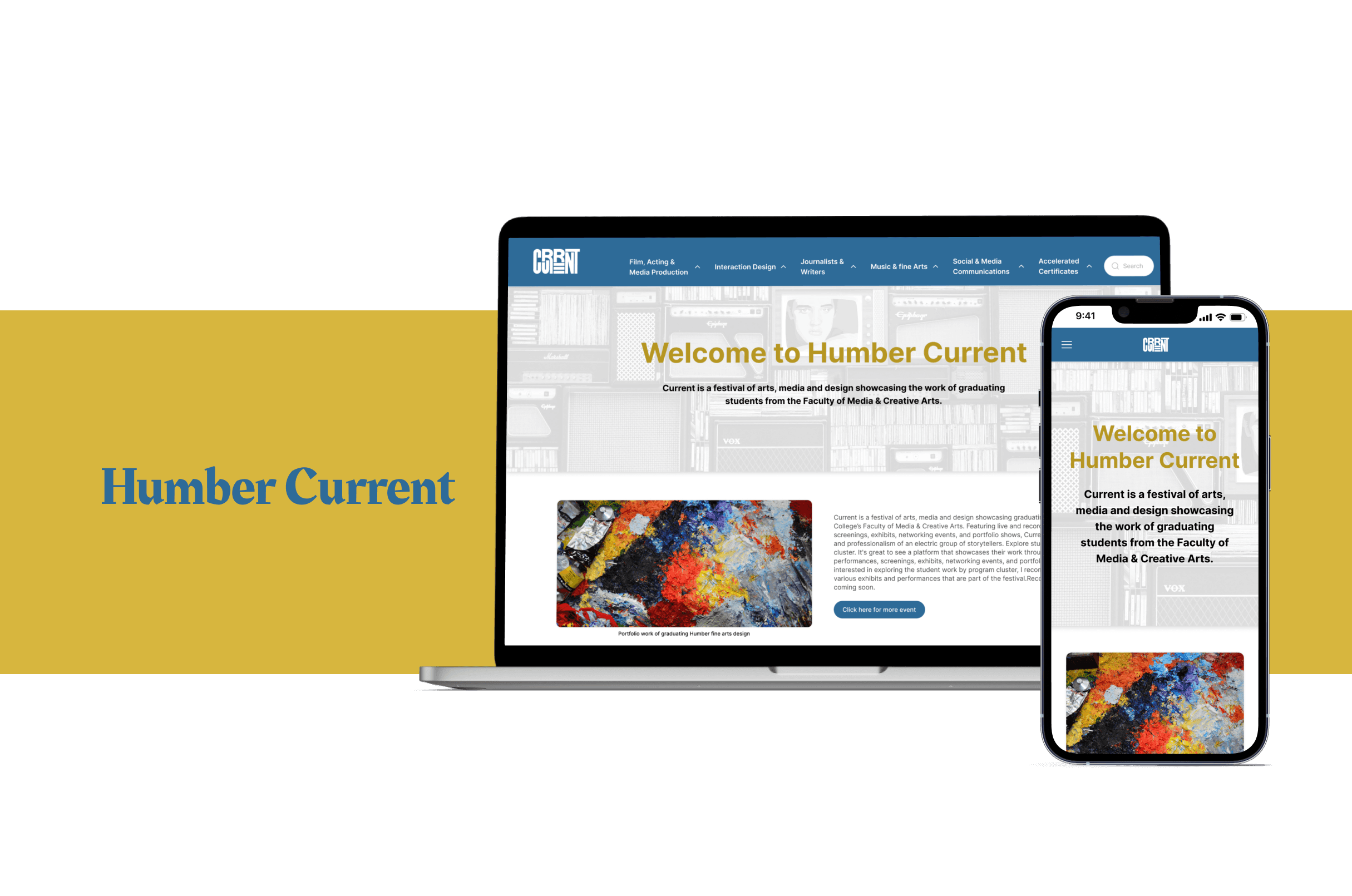
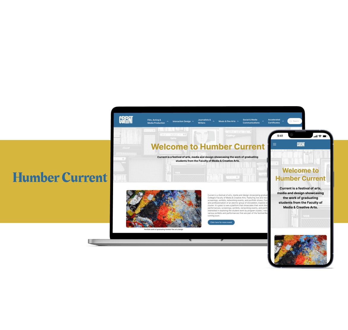
Redesign of Humber college current page
Redesign of Humber college current page
TIME
6 weeks
PLATFORM
Figma
Miro
Photoshop
MY ROLES
UI/UX Designer
Visual Designer
DELIVERABLES
High-fidelity interactive for mobile and desktop
Background
Background
Hub for Humber’s respected alumni community, which showcases students accomplishments, students share their stories and interest in connecting with fellow graduates. It also provides a space for the alumni to highlight their professional achievements and share their experiences since graduation, which inspires current students to pursue their passions.
Hub for Humber’s respected alumni community, which showcases students accomplishments, students share their stories and interest in connecting with fellow graduates. It also provides a space for the alumni to highlight their professional achievements and share their experiences since graduation, which inspires current students to pursue their passions.
Overview
Overview
A portfolio website makes it simple for students to present their work to potential employers.
The portfolio website serves students as an employment strategy. It allows students to get practical understanding of diverse student portfolios and build their portfolio even build skills.
It also helps recruiters find the best students with the necessary skill sets and experience for specific job needs.
Overview
A portfolio website makes it simple for students to present their work to potential employers.
The portfolio website serves students as an employment strategy. It allows students to get practical understanding of diverse student portfolios and build their portfolio even build skills.
It also helps recruiters find the best students with the necessary skill sets and experience for specific job needs.
Problem
Problem
Humber Current is a significant source for Humber College since it showcases students' accomplishments, which enhances the college's reputation and economic growth. However, the HumberCurrent website was not optimized for a seamless user experience, and the main logo and theme of the website are not in keeping with theHumber College website's design guidelines.
Humber Current is a significant source for Humber College since it showcases students' accomplishments, which enhances the college's reputation and economic growth. However, the HumberCurrent website was not optimized for a seamless user experience, and the main logo and theme of the website are not in keeping with theHumber College website's design guidelines.
Proposed Solution
Proposed Solution
Our goal for the Humber Current is to enhance and restructure the platform to connect students and companies from all overCanada, foster meaningful interactions, and provide them with access to a wide range of opportunities and tools to help their persona land professional progress.
Our goal for the Humber Current is to enhance and restructure the platform to connect students and companies from all overCanada, foster meaningful interactions, and provide them with access to a wide range of opportunities and tools to help their persona land professional progress.
Also, to provide a thriving online community for alumni where they can connect, share information, and celebrate triumphs while working on ideas and projects that benefit the university and society.
Also, to provide a thriving online community for alumni where they can connect, share information, and celebrate triumphs while working on ideas and projects that benefit the university and society.
Design Thinking Process
Empathize
Empathize
Empathize
Heuristic evaluation
Heuristic evaluation
Heuristic evaluation
Competitive Analysis
Competitive Analysis
Competitive Analysis
Define
Define
Define
Usability Testing
Usability Testing
Usability Testing
Persona &
Persona &
Persona &
User Journey Map
User Journey Map
User Journey Map
Ideate
Ideate
Ideate
User Flow
User Flow
User Flow
Sketches
Sketches
Sketches
Design
Design
Design
Wireframes
Wireframes
Wireframes
High Fidelity
& Prototype
High Fidelity
& Prototype
High Fidelity
& Prototype
Test
Test
Test
Usability Test
Usability Test
Usability Test
Iterate Prototype
Iterate Prototype
Iterate Prototype
Research
Problem
Problem
Research
My research first centered around heuristic evaluation, which helped me understand would specific issues that Humber Current would need to address, and then the competition space to understand how other websites are addressing similar issues. And lastly, the usability test was done by inviting participants one at a time to execute the activities while thinking aloud. Encourage them to express their opinions, impressions, and any challenges they face during the membership purchasing flow.
Findings:
Humber Current is a significant source for Humber College since it showcases students' accomplishments, which enhances the college's reputation and economic growth. However, the HumberCurrent website was not optimized for a seamless user experience, and the main logo and theme of the website are not in keeping with theHumber College website's design guidelines.
Humber Current is a significant source for Humber College since it showcases students' accomplishments, which enhances the college's reputation and economic growth. However, the HumberCurrent website was not optimized for a seamless user experience, and the main logo and theme of the website are not in keeping with theHumber College website's design guidelines.
My research first centered around heuristic evaluation, which helped me understand would specific issues that Humber Current would need to address, and then the competition space to understand how other websites are addressing similar issues. And lastly, the usability test was done by inviting participants one at a time to execute the activities while thinking aloud. Encourage them to express their opinions, impressions, and any challenges they face during the membership purchasing flow.
Findings:
From the heuristic evaluation, I came toknow that I must focus on providing a smoothuser experience, and the main logo and themeof the website do not adhere to the designcriteria of the Humber College website.
From the heuristic evaluation, I came toknow that I must focus on providing a smoothuser experience, and the main logo and themeof the website do not adhere to the designcriteria of the Humber College website.
From the competitor analysis, I determined that I needed to have detailed information about the student so that the recruiter knows what they were interested in.
From the competitor analysis, I determined that I needed to have detailed information about the student so that the recruiter knows what they were interested in.
Research
My research first centered around heuristic evaluation, which helped me understand would specific issues that Humber Current would need to address, and then the competition space to understand how other websites are addressing similar issues. And lastly, the usability test was done by inviting participants one at a time to execute the activities while thinking aloud. Encourage them to express their opinions, impressions, and any challenges they face during the membership purchasing flow.
Findings:
From the heuristic evaluation, I came toknow that I must focus on providing a smoothuser experience, and the main logo and themeof the website do not adhere to the designcriteria of the Humber College website.
From the competitor analysis, I determined that I needed to have detailed information about the student so that the recruiter knows what they were interested in.
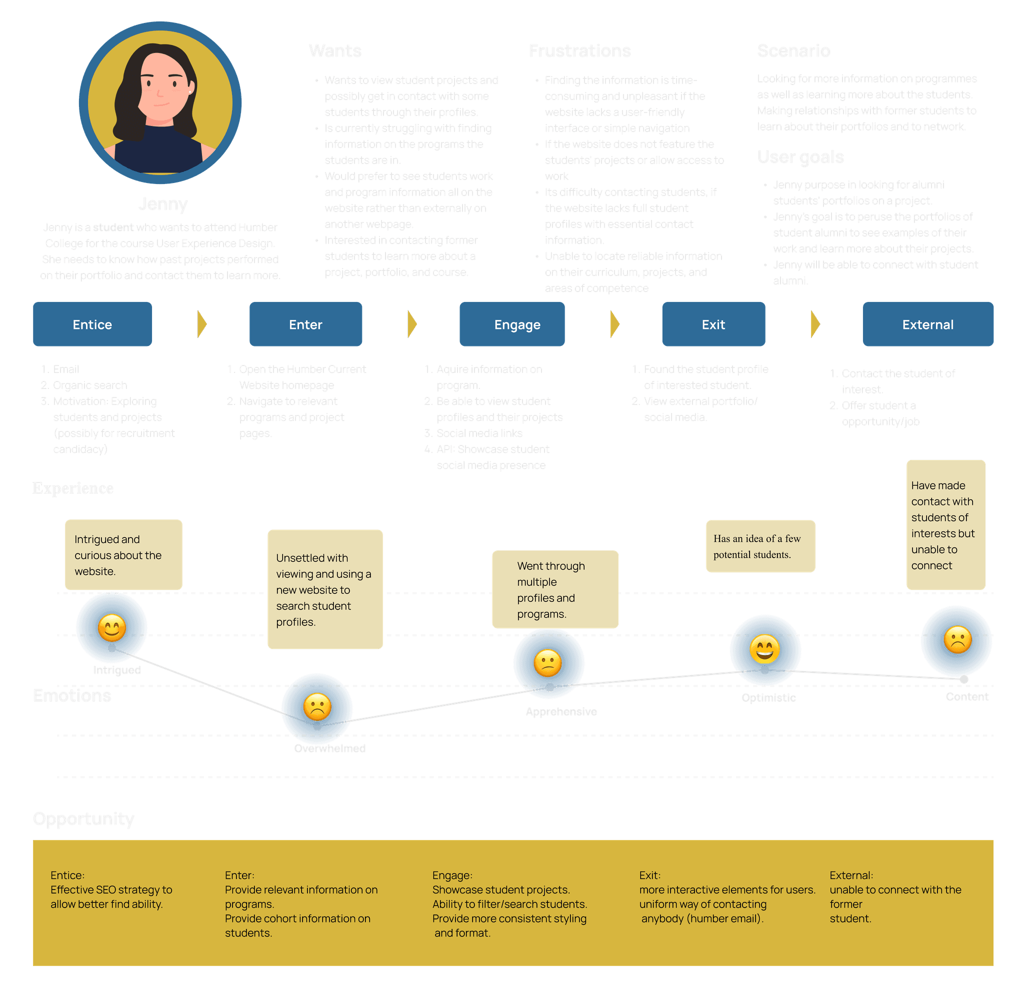
Analyzing Common Tasks to Increase User Empathy
Analyzing Common Tasks to Increase User Empathy
A closer examination of the usability testing indicated that all the users were experiencing the same set of problems. However, by creating and analyzing persona path maps, I discovered critical emotional and procedural touch points that the website must address.
If Jenny wants to find the portfolio of a student alumni to understand how a project works and wants to get connected with the alumni, The journey map depicts Jenny's experience on a website searching for and connecting with alumni students' portfolios.
Hypothesis
Hypothesis
"Implementing a filter/search functionality into Humber's current student portfolio system will result in a better user experience, as measured by increased user engagement, satisfaction, and successful search portfolio."
"Showcasing student projects on a platform will increase user interest and engagement with the projects, as measured by user views, time spent on the platform, and user feedback."
"If we provide relevant and comprehensive information on programs, the users' experience and engagement will improve, as measured by user satisfaction, time spent on the platform, and conversion rates."
Hypothesis
"Implementing a filter/search functionality into Humber's current student portfolio system will result in a better user experience, as measured by increased user engagement, satisfaction, and successful search portfolio."
"Showcasing student projects on a platform will increase user interest and engagement with the projects, as measured by user views, time spent on the platform, and user feedback."
"If we provide relevant and comprehensive information on programs, the users' experience and engagement will improve, as measured by user satisfaction, time spent on the platform, and conversion rates."
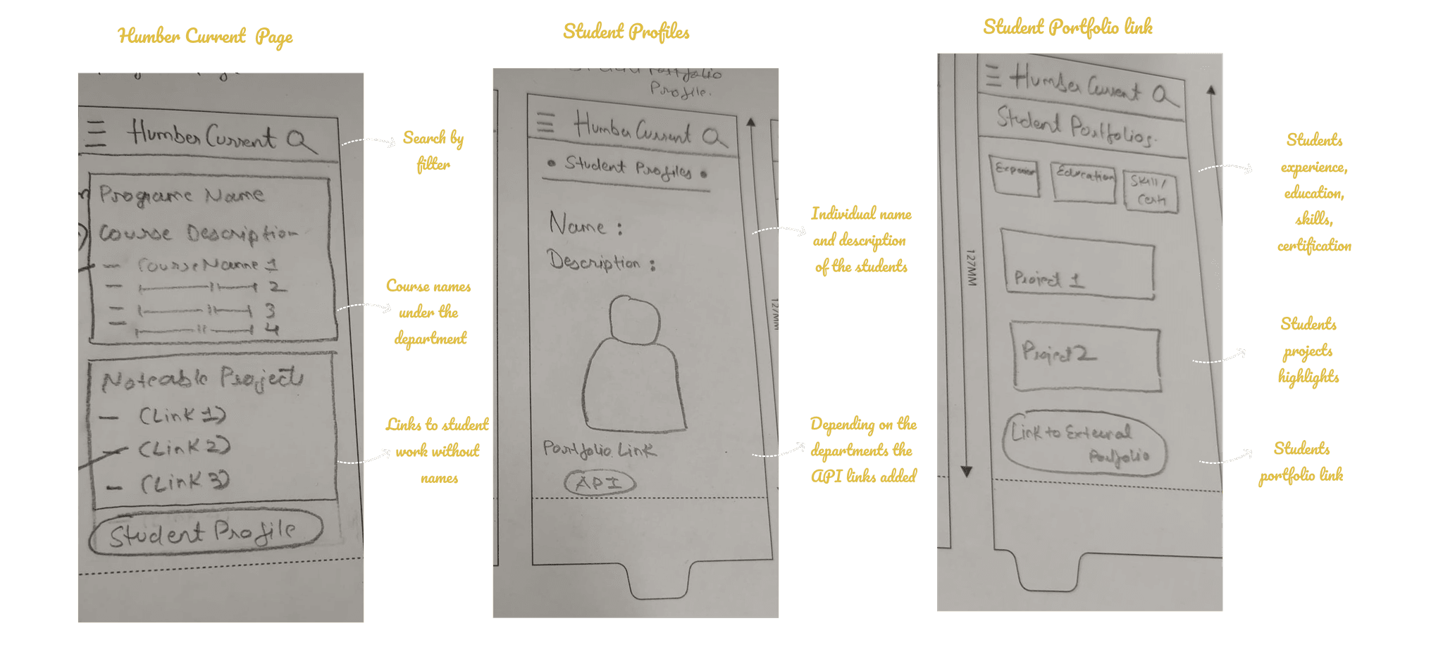
Creating Structure
Creating Structure
Based on user journey mapping, the user flow highlights the primary task streams that the high-quality prototype would focus on: As there are many courses, providing a search option for obtaining course-related information is a necessity.
Based on a survey, competition analysis, and usability test, this user flow highlights the primary task streams that the high-quality prototype would focus on:
Giving less information and focusing on recently passed-out student alternatives make sit easy for users
Giving less information and focusing on recently passed-out student alternatives make sit easy for users
Allowing users to search by key words such as projects, year, names, and so on makes it easier for them to find a project-related portfolio
Allowing users to search by key words such as projects, year, names, and so on makes it easier for them to find a project-related portfolio
Emphasizing the portfolio and LinkedIn links to connect
Emphasizing the portfolio and LinkedIn links to connect
Visualizing a User Centric Experience
Visualizing a User Centric Experience
Rapid sketching allowed me to investigate design patterns common among competing apps, assisting me in determining which needed to be carried over into Humber Current to ensure familiarity. This also assisted in identifying screen types that might serve numerous roles, as well as the most intuitive swiping and touch gestures.
Rapid sketching allowed me to investigate design patterns common among competing apps, assisting me in determining which needed to be carried over into Humber Current to ensure familiarity. This also assisted in identifying screen types that might serve numerous roles, as well as the most intuitive swiping and touch gestures.
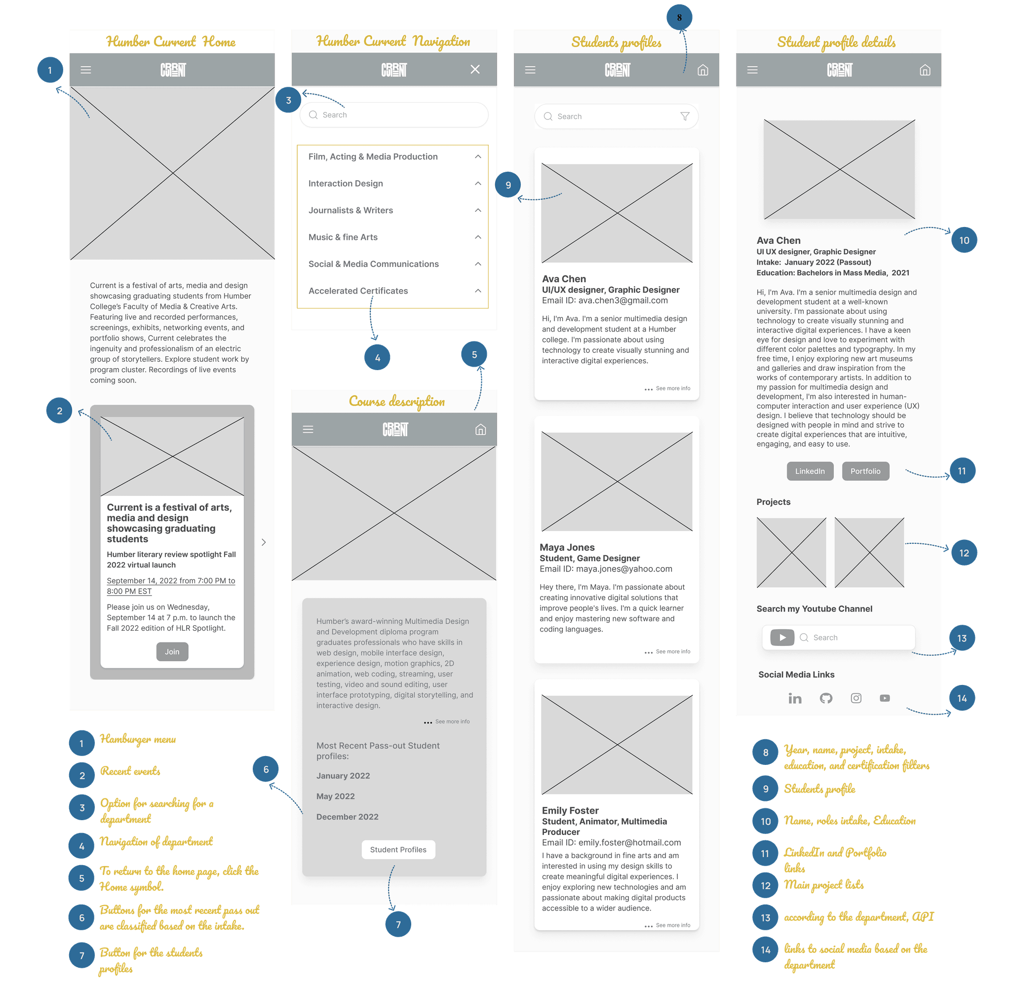
Uuderstanding What Users Find Intuitive, and Why
Uuderstanding What Users Find Intuitive, and Why
Low-fidelity prototype testing enabled me to gain a better understanding of how consumers anticipated doing the activities I was focusing on. I recognized which improvements needed to be made to lay the framework for a more fully realized high-fidelity prototype by watching their touch and swipe actions and, more crucially, having a dialogue with them about what they expected and when. Small things like actionable and consistent iconography, as well as consistent paths to return, would become critical components of the design system.
Low-fidelity prototype testing enabled me to gain a better understanding of how consumers anticipated doing the activities I was focusing on. I recognized which improvements needed to be made to lay the framework for a more fully realized high-fidelity prototype by watching their touch and swipe actions and, more crucially, having a dialogue with them about what they expected and when. Small things like actionable and consistent iconography, as well as consistent paths to return, would become critical components of the design system.
Creating visual design
Creating visual design
Visually articulating all potential aspects of the Speedy Eats brand (product, marketing, and beyond) meant defining a baseline design system that identified key elements of its visual vocabulary. I wanted "Speedy Eats" visual design to always refer back to its core mission of empowering dine-in services for customers.
Predominantly Blue palettes imbued screens with Satisfying/ energizing: In the west, blue are typically associated with fall traditions, such as pumpkin items, squash, and candy corn.
Simple button states and clear iconography like"Inter" would make chores feel more achievable, while a single, modern sans-serif with wide, open counters would assure legibility and clarity in messaging.
Inter
Ag
ABCDEFGHIJKLMNOPQRSTUVWXYZ
abcdefghijklmnopqrstuvwxyz
0123456789 !@#$%^&*()
Visually articulating all potential aspects of theSpeedy Eats brand (product, marketing, and beyond) meant defining a baseline design system that identified key elements of its visual vocabulary. I wanted "Speedy Eats" visual design to always refer back to its core mission of empowering dine-in services for customers.
Predominantly orange palettes imbuedscreens with Satisfying/energizing: In the west,orange foods are typically associated with falltraditions, such as pumpkin items, squash, andcandy corn.
Simple button states and clear iconography like"Poppins" would make chores feel more achievable, while a single, modern sans-serif with wide, open counters would assure legibility and clarity in messaging.
IAg
ABCDEFGHIJKLMNOPQRSTUVWXYZ
abcdefghijklmnopqrstuvwxyz
0123456789 !@#$%^&*()
Creating visual design
Visually articulating all potential aspects of the Speedy Eats brand (product, marketing, and beyond) meant defining a baseline design system that identified key elements of its visual vocabulary. I wanted "Speedy Eats" visual design to always refer back to its core mission of empowering dine-in services for customers.
Predominantly Blue palettes imbued screens with Satisfying/ energizing: In the west, Blue are typically associated with fall traditions, such as pumpkin items, squash, and candy corn.
Simple button states and clear iconography like"Inter" would make chores feel more achievable, while a single, modern sans-serif with wide, open counters would assure legibility and clarity in messaging.
Inter
Ag
ABCDEFGHIJKLMNOPQRSTUVWXYZ
abcdefghijklmnopqrstuvwxyz
0123456789 !@#$%^&*()
Cr
Primary
#2E6B98
Blue
#D7B63E
Gold Yellow
Secondary
#494949
Grey
#6C737F
Grey Blue
Base
#000000
Black
#FFFFFF
White
Surfacing New Issues
Surfacing New Issues
In the wireframes created for a high-fidelity prototype, I have integrated the visuals. After that, I did the usability testing with the high-fidelity prototype.
My aim was to address the precise spots of friction with thoughtful writing and to ensure that the design patterns I used were as obvious as possible and consistent with the entire experience.
Potential usability improvements included:
1. The students profile button is added after the Most Recent Pass-out Student profiles where users could find them took longer to locate, so I changed it to immediately after the paragraphs so that the visibility of clicking is increased.
2. Some users reported that the linked-in and portfolio links on the students' profile pages were missing if they wanted to view them right away, so I have added them and removed the gmail ID.
3. The linkedIn and portfolio links were placed after the student's information, which I felt was unnecessary during the usability test; therefore,I moved the links before the information and highlighted it.
4. Due to user concerns about lacking education, certification, and social links, I placed them in a different manner for the project.
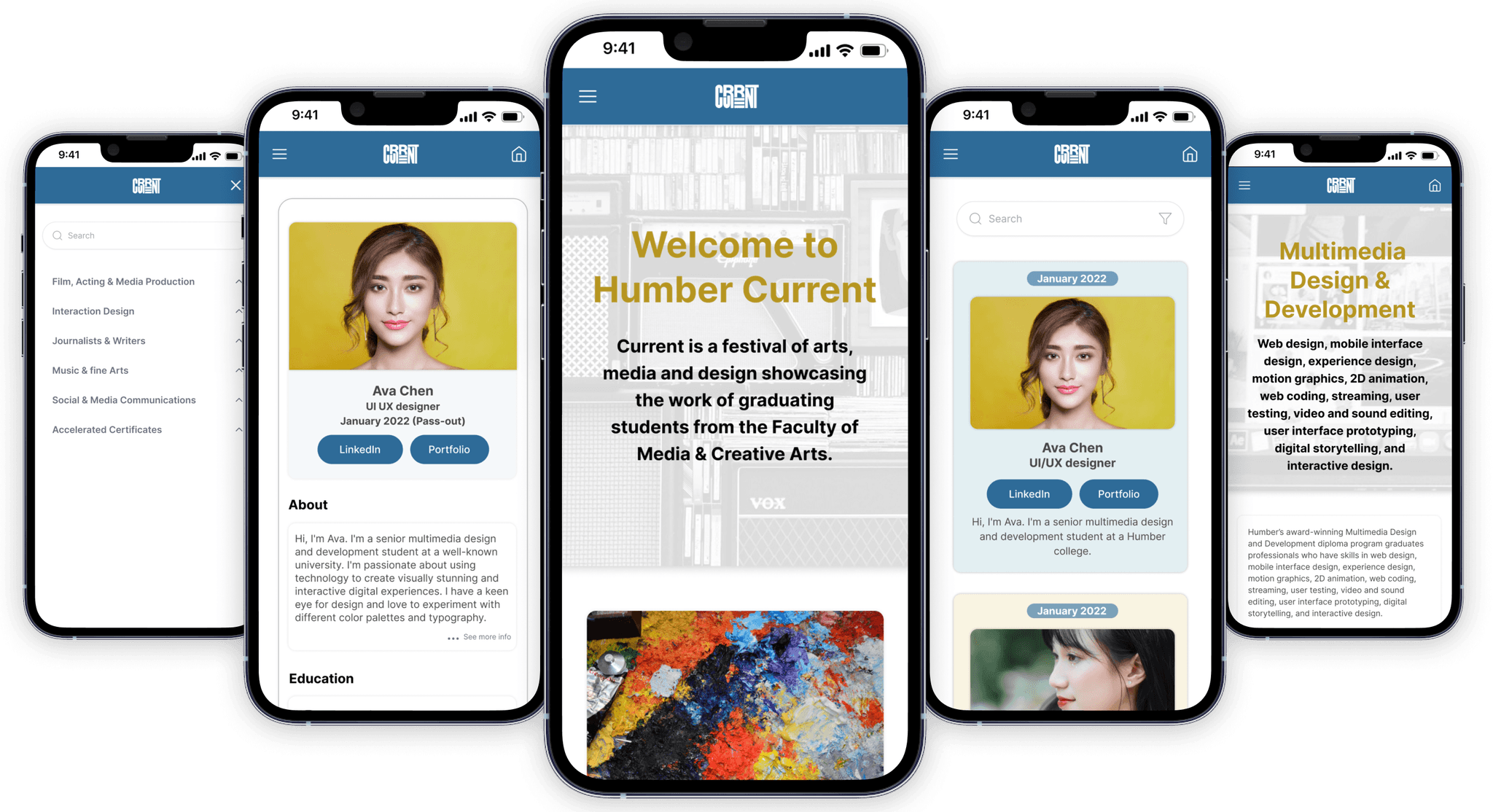
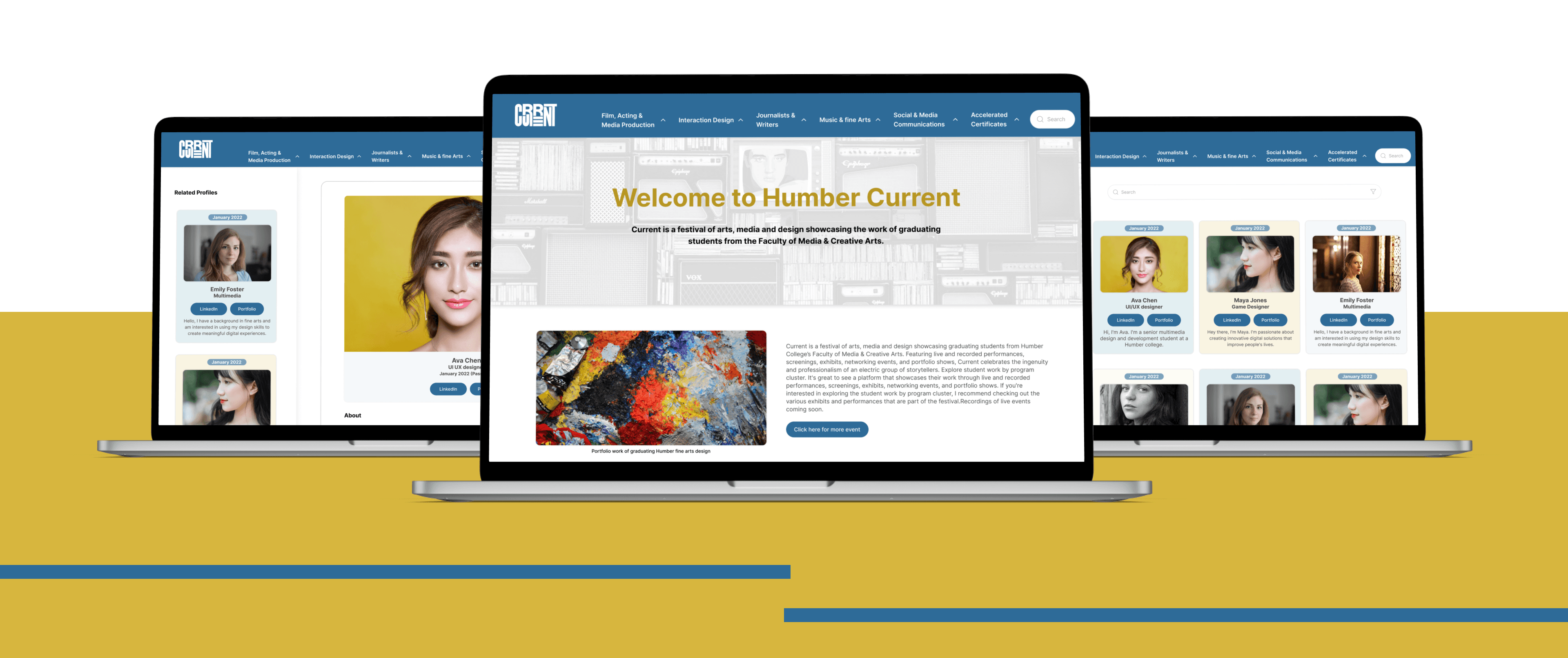
Clickable prototype & can be enlarged for better experience of mobile high-fidelity prototype
Clickable prototype & can be enlarged for better experience of Web high-fidelity prototype
Clickable prototype & can be enlarged for better experience of Web high-fidelity prototype
Clickable prototype & can be enlarged for better experience of mobile high-fidelity prototype
Clickable prototype & can be enlarged for better experience of Web high-fidelity prototype
Clickable prototype & can be enlarged for better experience of mobile high-fidelity prototype
Clickable prototype & can be enlarged for better experience of mobile high-fidelity prototype
Clickable prototype & can be enlarged for better experience of Web high-fidelity prototype
Lesson Learned
Lesson Learned
1. I observed pain spots and opportunities for improvement by analyzing user comments and conducting usability testing. The lesson here is to prioritize user wants and preferences when designing an interface to make it more intuitive and user-friendly.
2. When relevant and thorough information about the student is made available through easy navigation of the portfolio and connected links, it improves the user experience and engagement.
3. When information is well organized, users can more easily explore and discover the content they seek. Clear and logical information organization improves usability by decreasing confusion and irritation, resulting in a more positive user experience.
4. Working with a content strategist and developer on this project taught me the importance of aligning design elements with engaging content and ensuring seamless integration for a cohesive and user-friendly interface.
TIME
Duration: 8 weeks
TIME
8 weeks
TIME
8 weeks
PLATFORM
Figma
Miro
Photoshop
PLATFORM
Figma
Miro
Photoshop
PLATFORM
Figma
Miro
Photoshop
MY ROLES
UI/UX Designer
Visual Designer
MY ROLES
UI/UX Designer
Visual Designer
MY ROLES
UI/UX Designer
Visual Designer
DELIVERABLES
High-fidelity interactive prototypes for key tasks on desktop and mobile
DELIVERABLES
High-fidelity interactive for desktop and mobile
DELIVERABLES
High-fidelity interactive for desktop and mobile
Background
Hub for Humber’s respected alumni community, which showcases students accomplishments, students share their stories and interest in connecting with fellow graduates. It also provides a space for the alumni to highlight their professional achievements and share their experiences since graduation, which inspires current students to pursue their passions.
Primary
#2E6B98
Blue
#D7B63E
Gold Yellow
Secondary
#494949
Grey
#EFF5E6
Grey Blue
Base
#000000
Black
#FFFFFF
White
Primary
#2E6B98
Blue
#D7B63E
Gold Yellow
Secondary
#494949
Grey
#6C737F
Light White
Base
#000000
Black
#FFFFFF
White
Other Case studies
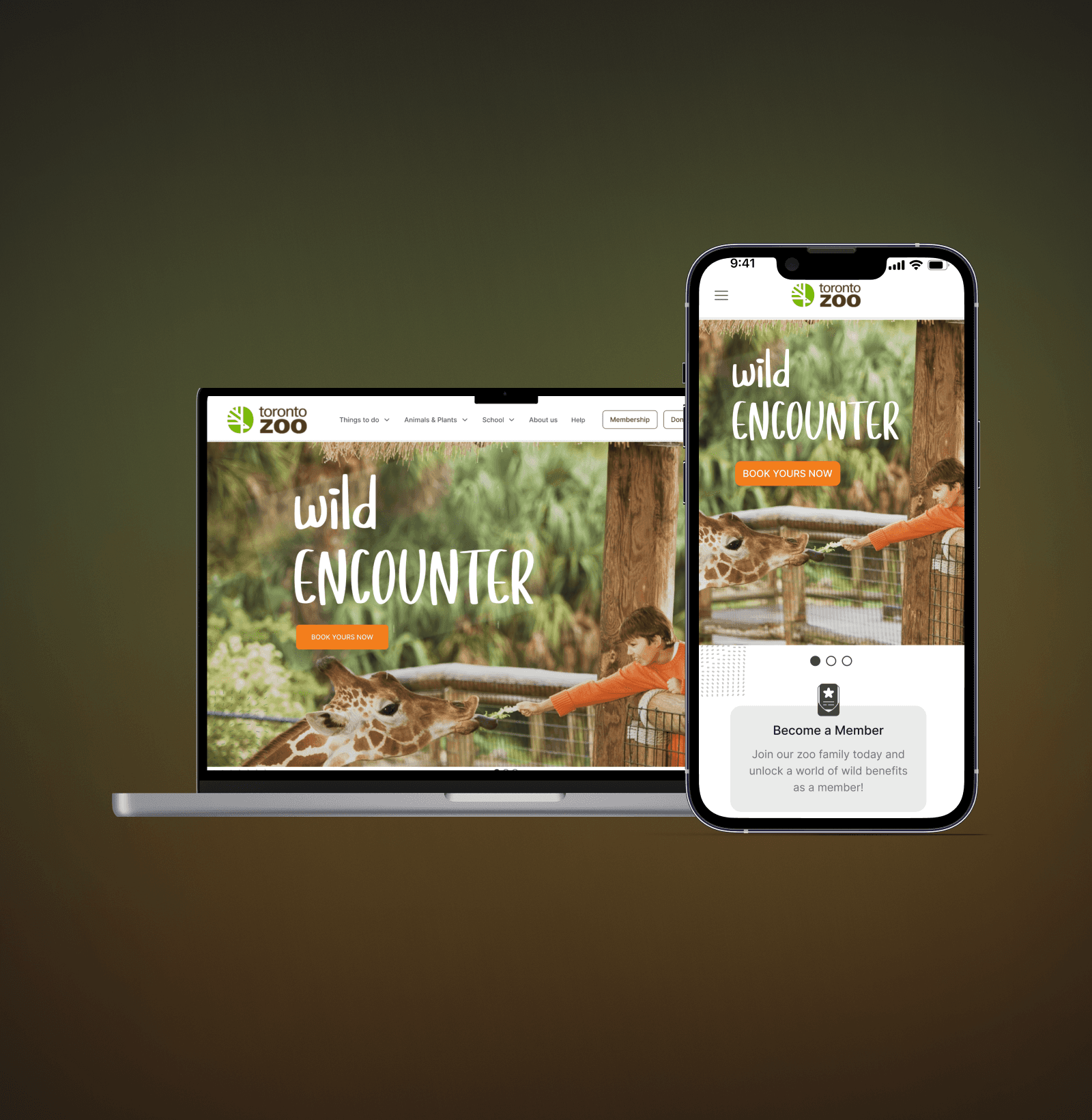
Redesign of Toronto Zoo
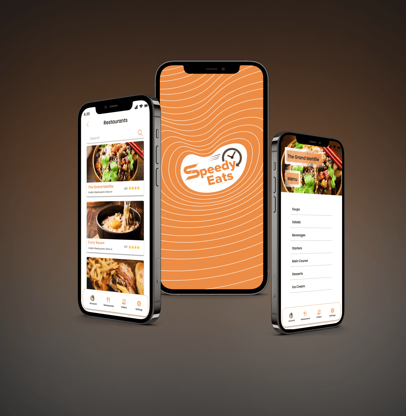
Speedy Eats
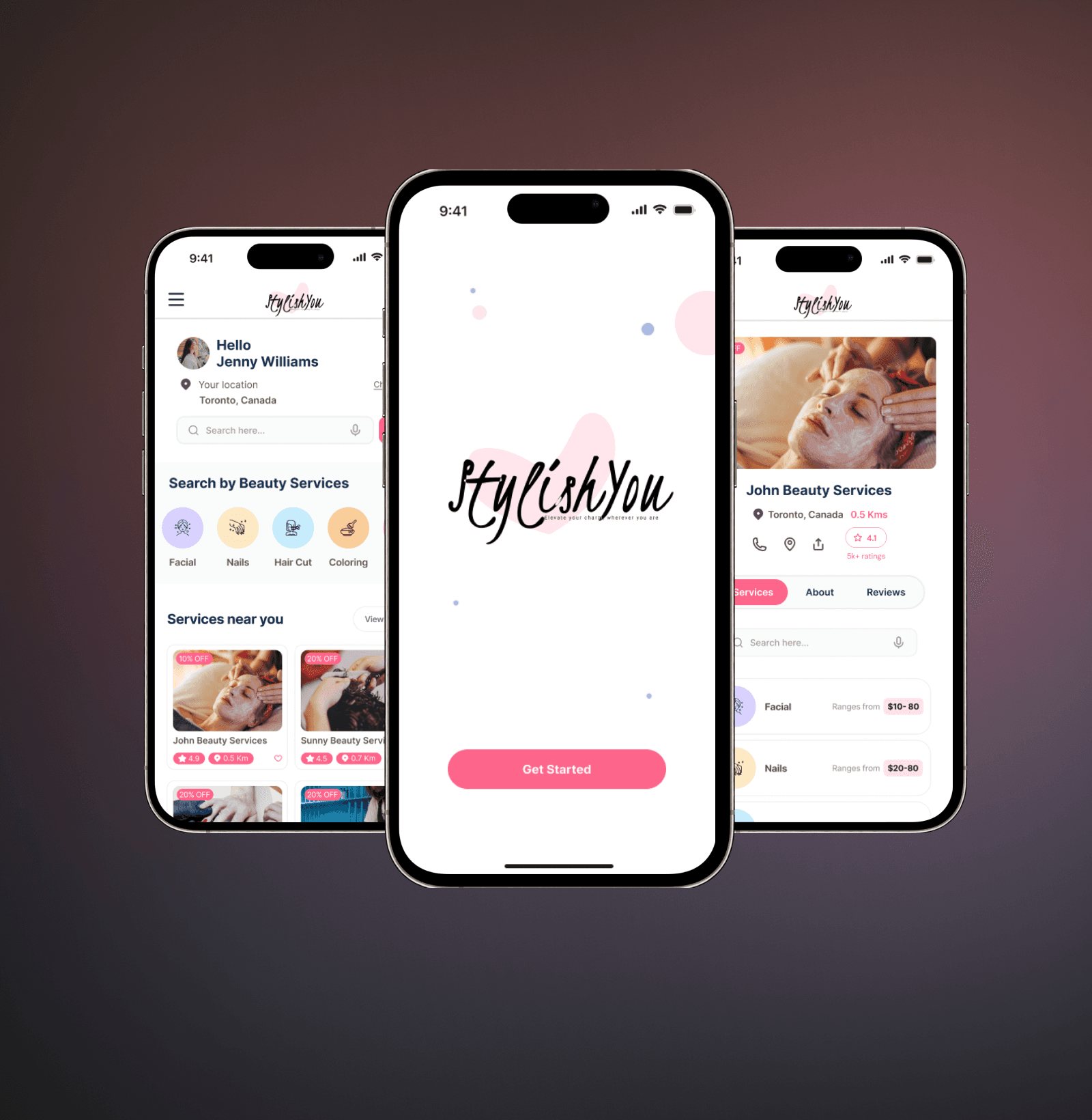
StylishYou
Vosyn (Coming Soon)
Redesign of Toronto Zoo
Speedy Eats
StylishYou
Vosyn (Coming Soon)
Redesign of Toronto Zoo
Speedy Eats
StylishYou
Vosyn (Coming Soon)
Redesign of Toronto Zoo
Speedy Eats
StylishYou
Vosyn (Coming Soon)
Redesign of Toronto Zoo
Speedy Eats
StylishYou
Vosyn (Coming Soon)
jgrth3@gmail.com
Copyright © 2023 Jagruthi Venkatesh Naidu. All rights reserved.
jgrth3@gmail.com
Copyright © 2023 Jagruthi Venkatesh Naidu. All rights reserved.
jgrth3@gmail.com
Copyright © 2023 Jagruthi Venkatesh Naidu. All rights reserved.