Case Study
Case Study
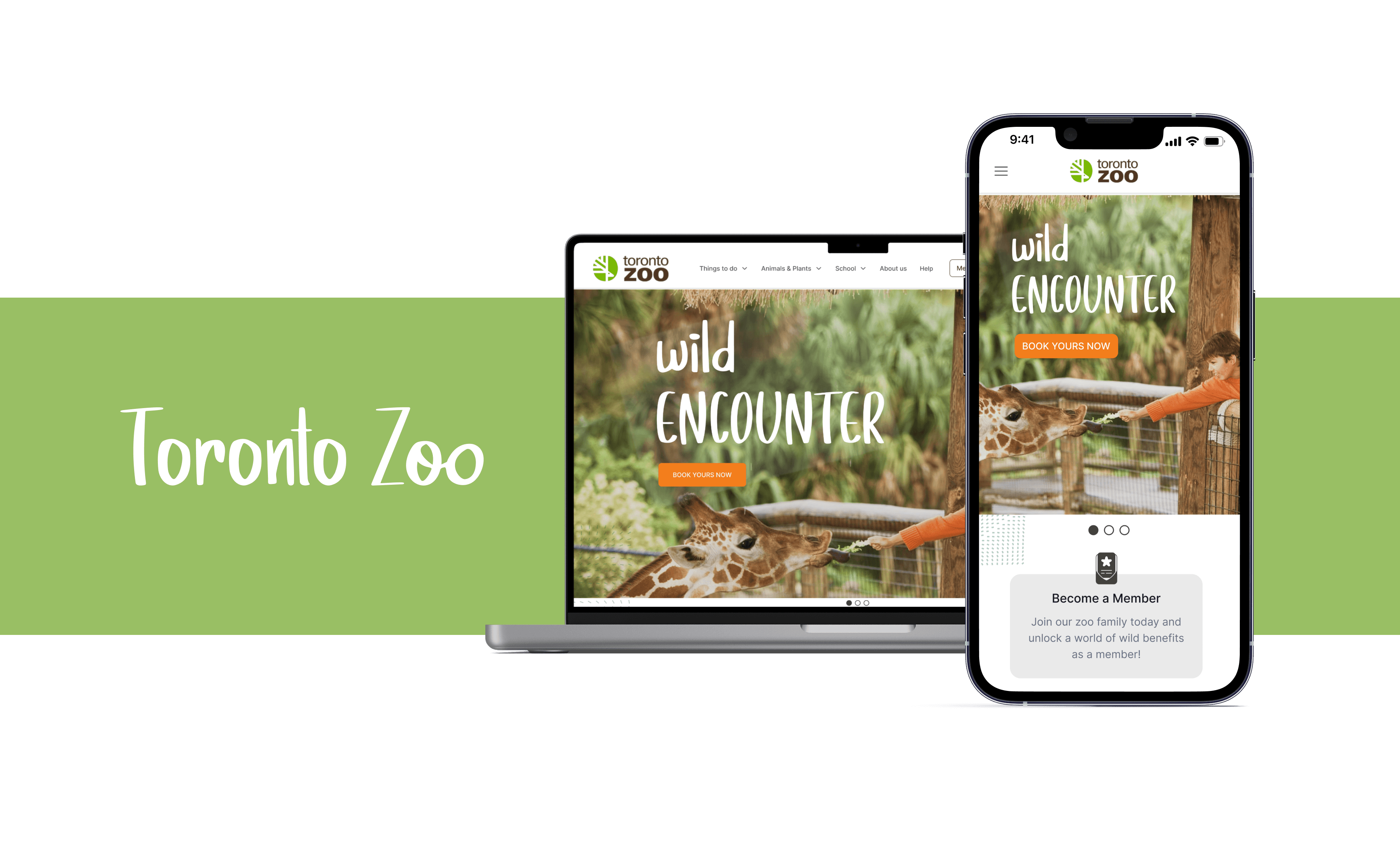
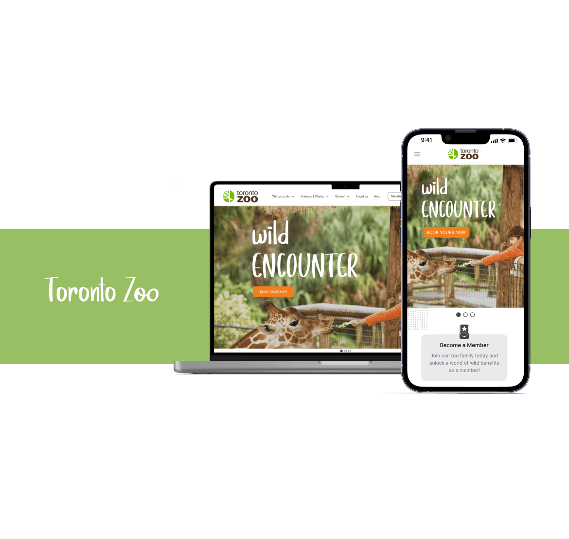
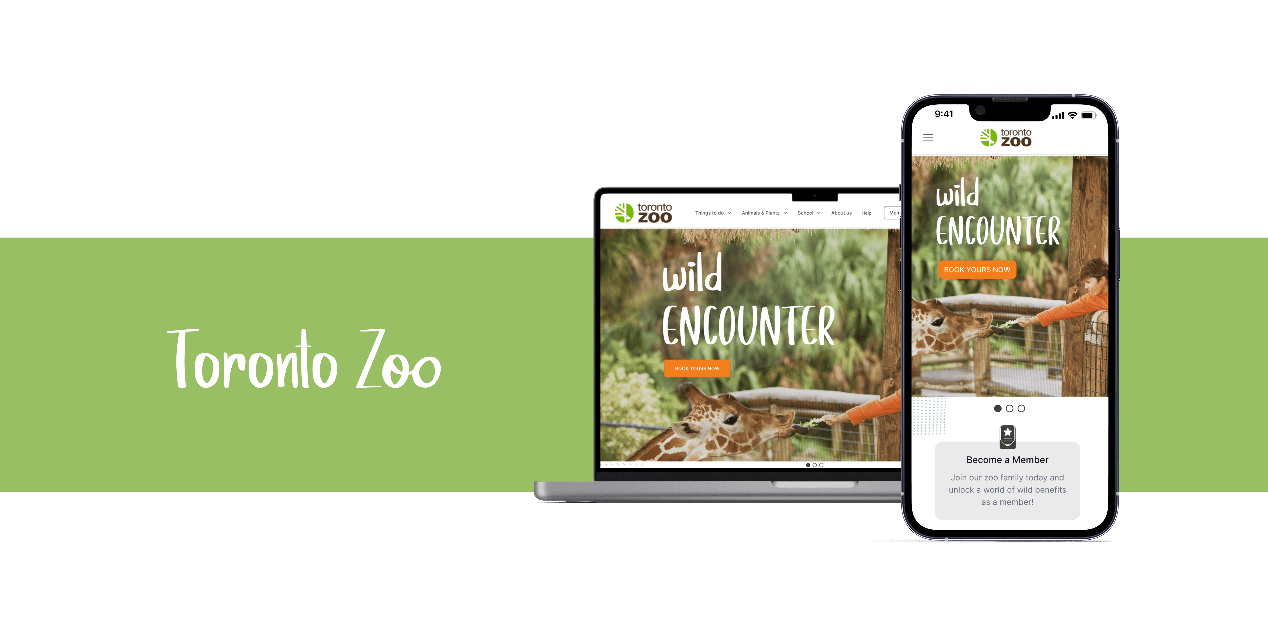
Redesign of Toronto Zoo Website and mobile
Redesign of Toronto Zoo Website and mobile

TIME
16 weeks
PLATFORM
Figma
Miro
Photoshop
MY ROLES
UI/UX Designer
Visual Designer
DELIVERABLES
High-fidelity interactive for desktop and mobile
Background
Background
Since its establishment in 1974, the Toronto Zoo has remained a fundamental institution within the Greater Toronto Area. Visitors to the zoo are afforded a special chance to witness and engage with animals spanning the globe, fostering unique connections. Moreover, the zoo's commitment to conservation and sustainability initiatives holds profound significance for the wider wildlife preservation community.
Since its establishment in 1974, the Toronto Zoo has remained a fundamental institution within the Greater Toronto Area. Visitors to the zoo are afforded a special chance to witness and engage with animals spanning the globe, fostering unique connections. Moreover, the zoo's commitment to conservation and sustainability initiatives holds profound significance for the wider wildlife preservation community.
Overview
Overview
I addressed issues faced by visitors navigating the Toronto Zoo's website, prioritizing user experience and simplifying the membership sign-up procedure. I focused on refining navigation by incorporating additional routes to essential user functions. A redesign of the membership website was undertaken, aiming to enhance organization according to user demographics, facilitating easier tracking of progress and adjustments. Furthermore, efforts were made to ensure comprehensive data collection and enhance page consistency. Additionally, we crafted a visually appealing website that harmonized with the Toronto Zoo's surroundings, employing natural hues to deliver a cohesive and immersive encounter.
I addressed issues faced by visitors navigating the Toronto Zoo's website, prioritizing user experience and simplifying the membership sign-up procedure. I focused on refining navigation by incorporating additional routes to essential user functions. A redesign of the membership website was undertaken, aiming to enhance organization according to user demographics, facilitating easier tracking of progress and adjustments. Furthermore, efforts were made to ensure comprehensive data collection and enhance page consistency. Additionally, we crafted a visually appealing website that harmonized with the Toronto Zoo's surroundings, employing natural hues to deliver a cohesive and immersive encounter.

Problem
Problem
Memberships are an important source of revenue for the Toronto Zoo; however, visitors to the zoo’s current website face many challenges throughout the sign-up process. Issues such as excessive amounts of unnecessary information and a counter-intuitive buying flow are resulting in fewer membership registrations, which in turn means less revenue and fewer visitors to the zoo
Memberships are an important source of revenue for the Toronto Zoo; however, visitors to the zoo’s current website face many challenges throughout the sign-up process. Issues such as excessive amounts of unnecessary information and a counter-intuitive buying flow are resulting in fewer membership registrations, which in turn means less revenue and fewer visitors to the zoo
Problem
Memberships are an important source of revenue for the Toronto Zoo; however, visitors to the zoo’s current website face many challenges throughout the sign-up process. Issues such as excessive amounts of unnecessary information and a counter-intuitive buying flow are resulting in fewer membership registrations, which in turn means less revenue and fewer visitors to the zoo
Proposed Solution
Proposed Solution
I devised a resolution for the hurdles encountered by users on the Toronto Zoo's website when attempting to finalize the purchase of a membership. My focus was on elevating the user experience and simplifying the membership sign-up procedure to the greatest extent feasible, while minimizing the presentation of non-essential information to users and enhancing the overall visual appeal.
I honed in on the following elements of the Toronto Zoo's website as the primary focus for redesign:
I came up with a solution to the challenges faced by visitors to the Toronto Zoo’s website:complete the purchase of a membership. I strove to prioritize the user experience and streamline the membership sign-up process as much as possible while reducing the amount of non-critical information presented to users and improving overall aesthetics.
I narrowed in on the following aspects of theToronto Zoo’s site as the focus of the redesign:
I came up with a solution to the challenges faced by visitors to the Toronto Zoo’s website:complete the purchase of a membership.I strove to prioritize the user experience and streamline the membership sign-up process as much as possible while reducing the amount of non-critical information presented to users and improving overall aesthetics.
I narrowed in on the following aspects of theToronto Zoo’s site as the focus of the redesign:
Navigation
I emphasized the significance of crafting a user-friendly website with easy navigation. I introduced additional pathways to key user actions, including booking tickets, memberships, and accessing the donation page.
I emphasized the significance of crafting a user-friendly website with easy navigation. I introduced additional pathways to key user actions, including booking tickets, memberships, and accessing the donation page.
Membership page
I overhauled the membership page, restructuring it according to demographics to facilitate easier tracking of progress and modifications for users. Additionally, I ensured comprehensive information gathering and enhanced consistency across all pages.
I overhauled the membership page, restructuring it according to demographics to facilitate easier tracking of progress and modifications for users. Additionally, I ensured comprehensive information gathering and enhanced consistency across all pages.
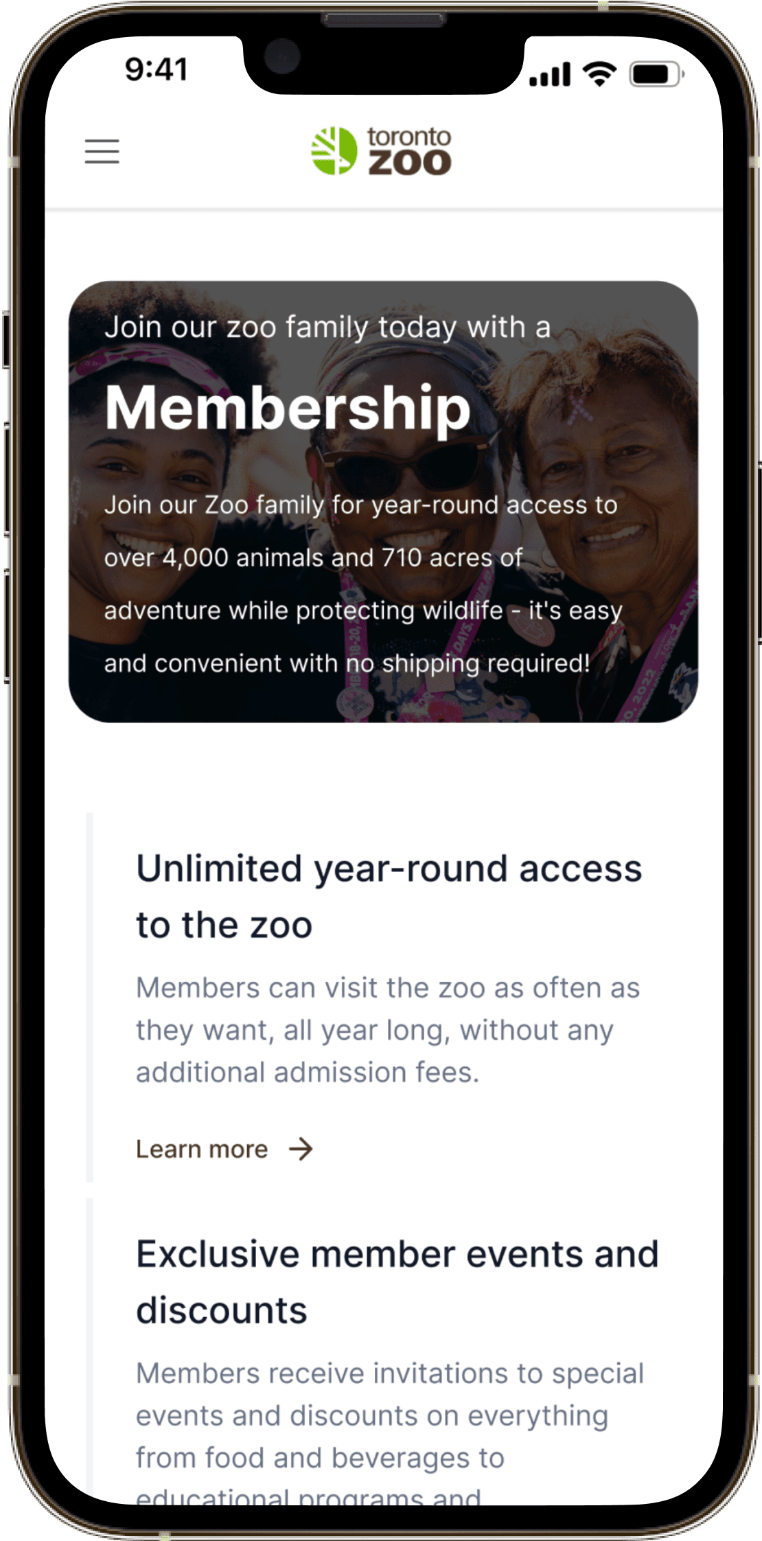
UI/Visual site Design
I crafted an aesthetically pleasing website that mirrors the environment of the Toronto Zoo, employing natural tones like brown to establish a unified and captivating encounter.
I crafted an aesthetically pleasing website that mirrors the environment of the Toronto Zoo, employing natural tones like brown to establish a unified and captivating encounter.
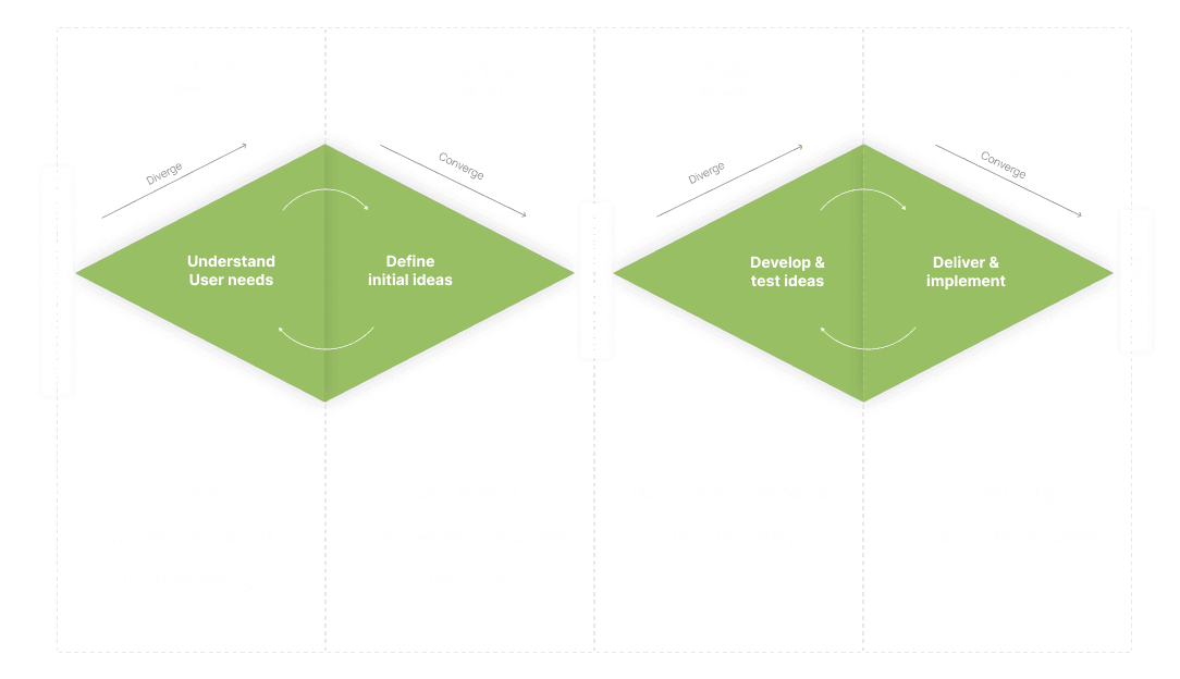
Double Diamond Design Process
Research
Research
Initially, My research focused on conducting a Survey to gain insight into specific issues requiring attention at the Toronto Zoo. Following this, I conducted a Competitive analysis to understand how similar challenges are being tackled on other websites. Lastly, I conducted a Usability test, where participants were invited one by one to complete various activities related to the membership purchasing process while verbalizing their thoughts. Participants were encouraged to share their opinions, impressions, and any difficulties encountered during the flow.
Initially, My research focused on conducting a Survey to gain insight into specific issues requiring attention at the Toronto Zoo. Following this, I conducted a Competitive analysis to understand how similar challenges are being tackled on other websites. Lastly, I conducted a Usability test, where participants were invited one by one to complete various activities related to the membership purchasing process while verbalizing their thoughts. Participants were encouraged to share their opinions, impressions, and any difficulties encountered during the flow.
Outcome 1
The survey results indicated that our primary areas of focus should be on improving the checkout process for purchasing memberships, addressing complexities or time-consuming aspects, clarifying the navigation structure to facilitate easier access to information, and enhancing the aesthetics of the Toronto Zoo website.
The survey results indicated that our primary areas of focus should be on improving the checkout process for purchasing memberships, addressing complexities or time-consuming aspects, clarifying the navigation structure to facilitate easier access to information, and enhancing the aesthetics of the Toronto Zoo website.
Outcome 2
The information provided for Toronto Zoo memberships lacks clarity, particularly regarding the duration of membership. For instance, data for one or two years of membership is consolidated or unclear.
The information provided for Toronto Zoo memberships lacks clarity, particularly regarding the duration of membership. For instance, data for one or two years of membership is consolidated or unclear.
Outcome 3
The Toronto Zoo website does not utilize standardized terminology for its sessions, leading to increased difficulty for users in understanding.
The Toronto Zoo website does not utilize standardized terminology for its sessions, leading to increased difficulty for users in understanding.
Outcome 4
Users experienced complexity and time-consuming steps when purchasing the membership plan.
Users experienced complexity and time-consuming steps when purchasing the membership plan.
Card Sorting
Card Sorting
I utilized open card sorting to compile a collection of cards containing items listed on the Miroboard. Ten participants were provided with unlabeled cards and instructed to group them according to their own criteria. This technique allowed for the observation of how users naturally categorize materials without predefined categories.
Subsequently, I developed a finalized card sort based on the patterns identified from the initial card sorting exercise.
As participant input is collaborative and iterative, I removed unnecessary cards from the card sort to enhance its efficiency.
Information Architecture
Information Architecture
Information Architecture
Information Architecture
The outcomes of a card sort aided in the development of the Information Architecture (IA) by revealing how users organize and categorize information. This helped me identify patterns in users' mental models and understand their expectations for finding information on the website.
Certain terminologies were revised as they didn't clearly convey their meaning in general usage. For example, "welfare" was changed to "animal welfare," and "live cam" was adjusted to "security camera footage."
Cards marked as duplicates (like "staff," "plan visit," and "our animals") were removed from the IA to streamline it, as their repetition was deemed unnecessary.
Creating Structure
Creating Structure
Informed by a survey, competitive analysis, and usability test, this user flow underscores the key task streams that the high-quality prototype would prioritize.
Informed by a survey, competitive analysis, and usability test, this user flow underscores the key task streams that the high-quality prototype would prioritize.
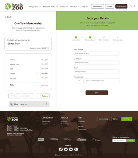
The membership sign-up process will be made practical while reducing the exposure of non-essential information to consumers.
The membership sign-up process will be made practical while reducing the exposure of non-essential information to consumers.
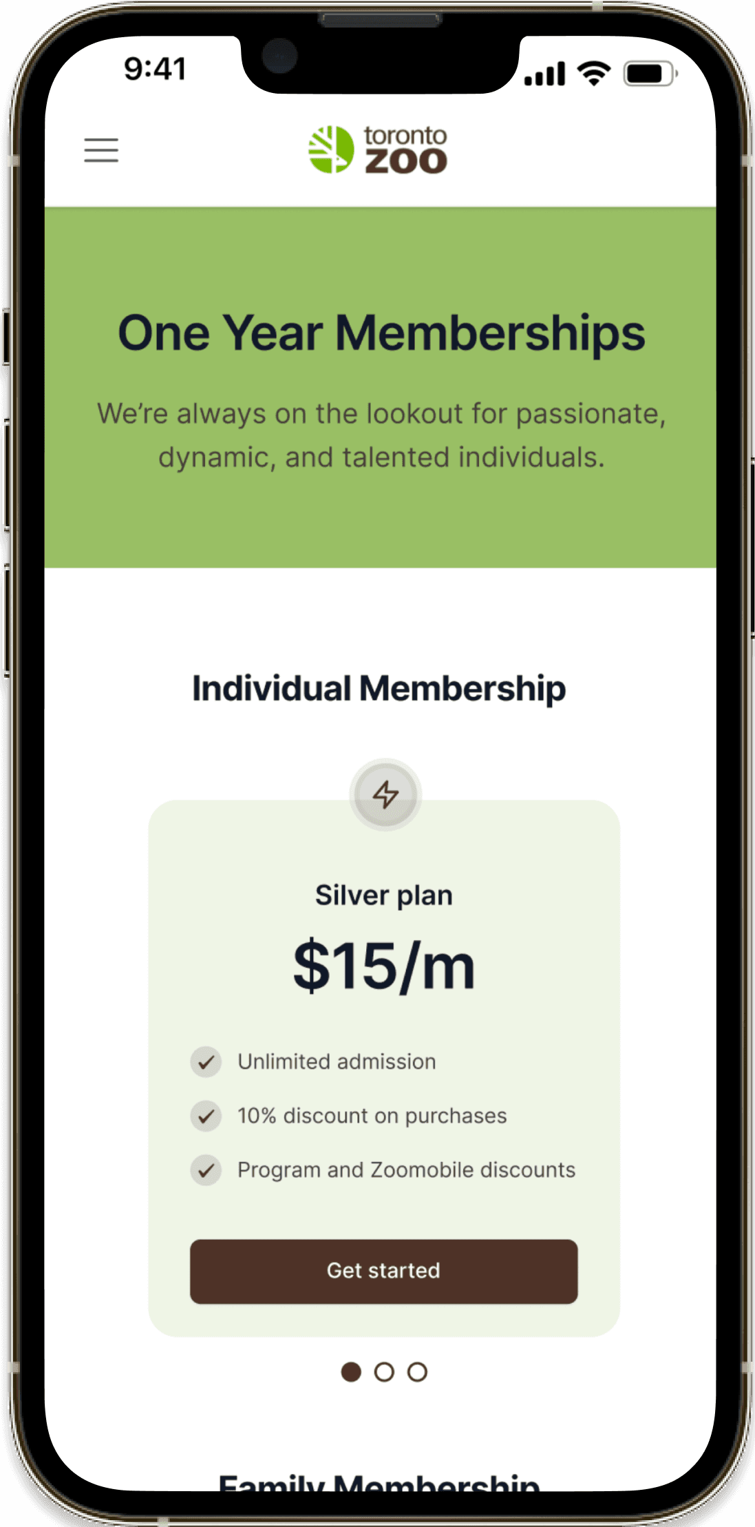
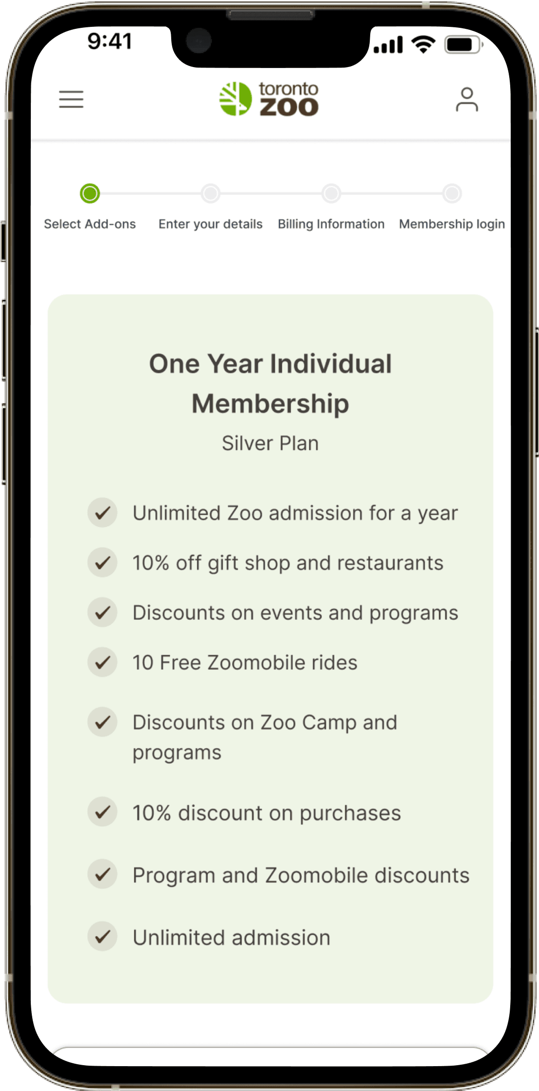
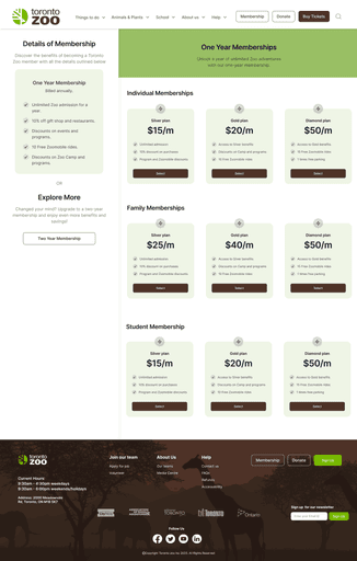
Primarily, I segregated the one-year and two-year options into distinct sections to distinguish between the choices and information provided.
Primarily, I segregated the one-year and two-year options into distinct sections to distinguish between the choices and information provided.
I chose to categorize the one-year and two-year membership options into three groups based on demographics: individuals, families, and students. This decision was made to facilitate easier decision-making for users
I chose to categorize the one-year and two-year membership options into three groups based on demographics: individuals, families, and students. This decision was made to facilitate easier decision-making for users
The user flow presented, along with the gathered user insights, will influence future design choices.
The user flow presented, along with the gathered user insights, will influence future design choices.
The user flow provided, combined with the user insight gathered thus far, would drive future design decisions.
The user flow provided, combined with the user insight gathered thus far, would drive future design decisions.
Visualizing a Seamless Integration
Visualizing a Seamless Integration
Visualizing a
Seamless Integration
Visualizing a
Seamless Integration
Multiple iterations of quick sketches on paper highlighted the difficulty of keeping essential tasks straightforward and at a single level. This exercise was crucial in uncovering prevailing design patterns and understanding how users would transition between screens.
Multiple iterations of quick sketches on paper highlighted the difficulty of keeping essential tasks straightforward and at a single level. This exercise was crucial in uncovering prevailing design patterns and understanding how users would transition between screens.
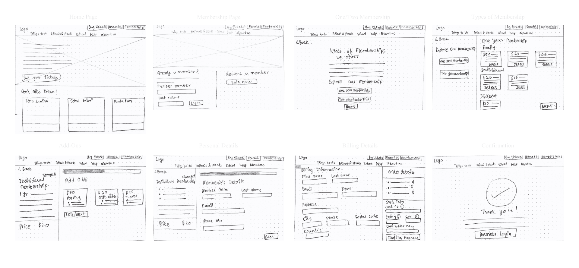
Pinpointing areas of ambiguity via schematic wireframe mockups
Pinpointing areas of ambiguity via schematic wireframe mockups
Following the sketching of flows, I transformed them into low-fidelity, clickable wireframes. During testing, individuals praised the membership purchasing process overall. However, confusion arose in two areas:
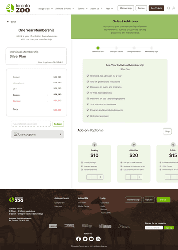
The breakdown of pricing, originally located within personal information, was not immediately clear. As a solution, I relocated this information to the add-ons section.
When asked, "Can users add multiple T-shirts?" we decided to address this by offering customers the ability to customize their T-shirts and other add-ons.
Following the sketching of flows, I transformed them into low-fidelity, clickable wireframes. During testing, individuals praised the membership purchasing process overall. However, confusion arose in two areas:
The breakdown of pricing, originally located within personal information, was not immediately clear. As a solution, I relocated this information to the add-ons section.
When asked, "Can users add multiple T-shirts?" we decided to address this by offering customers the ability to customize their T-shirts and other add-ons.
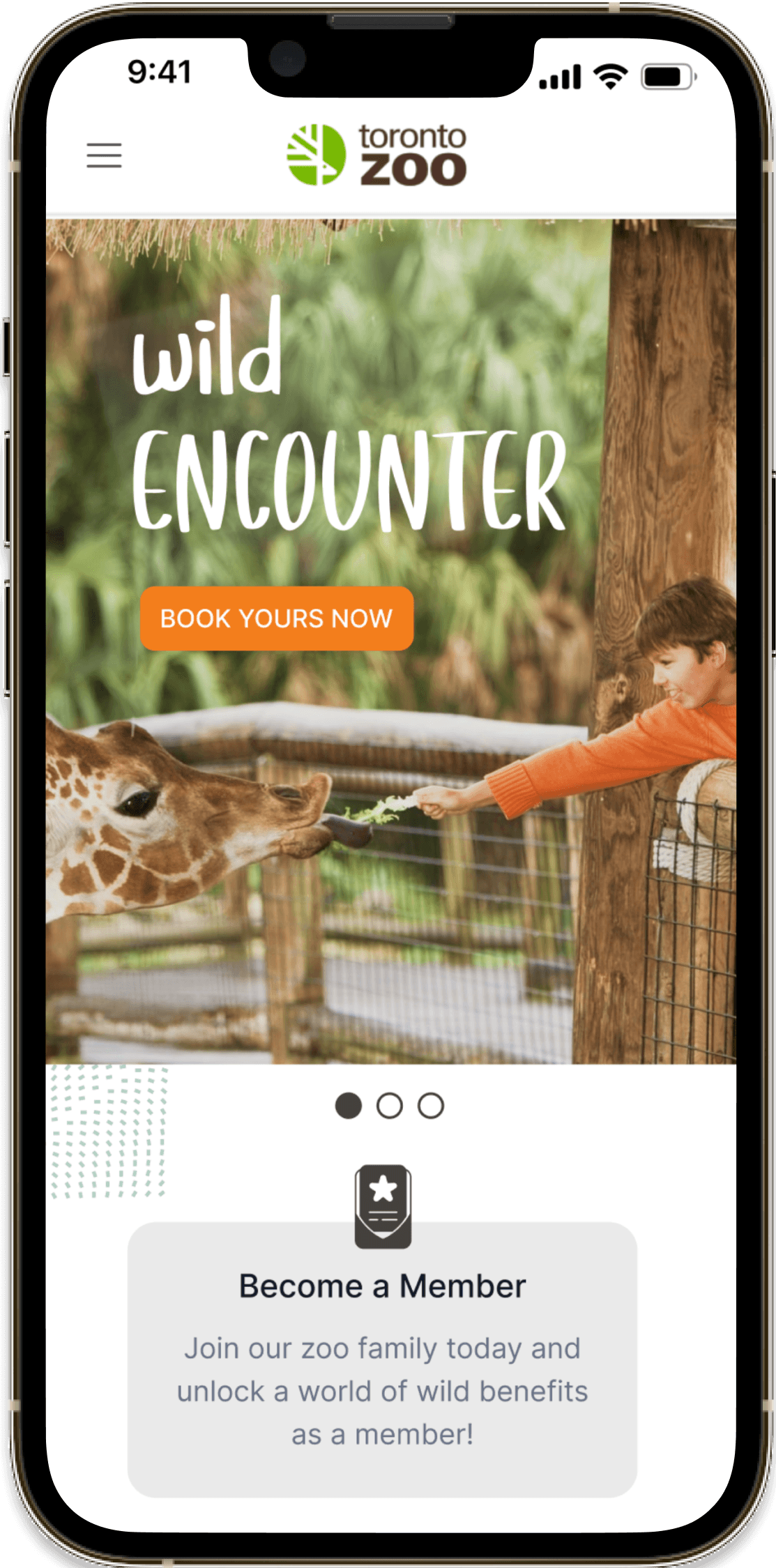
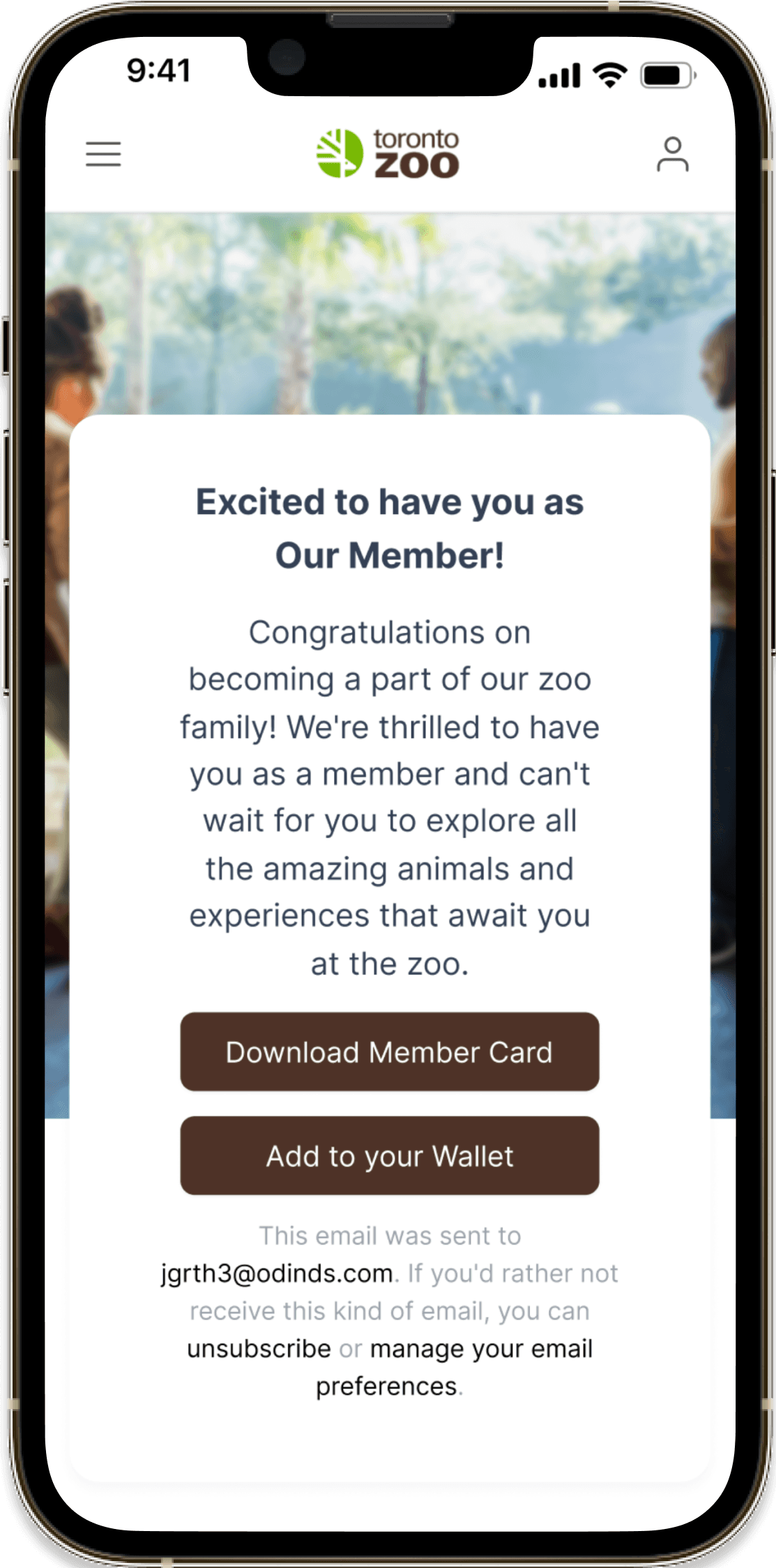
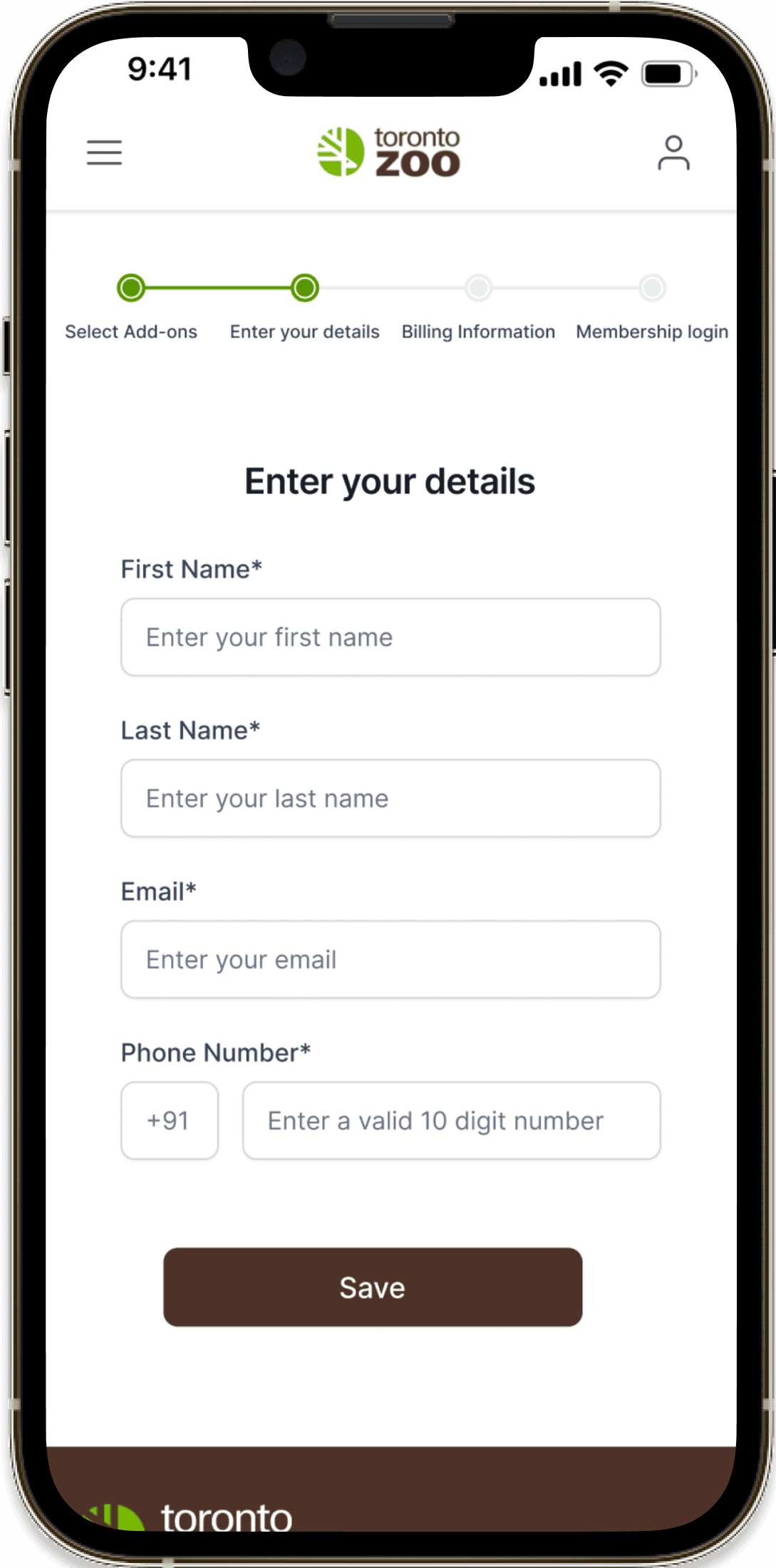
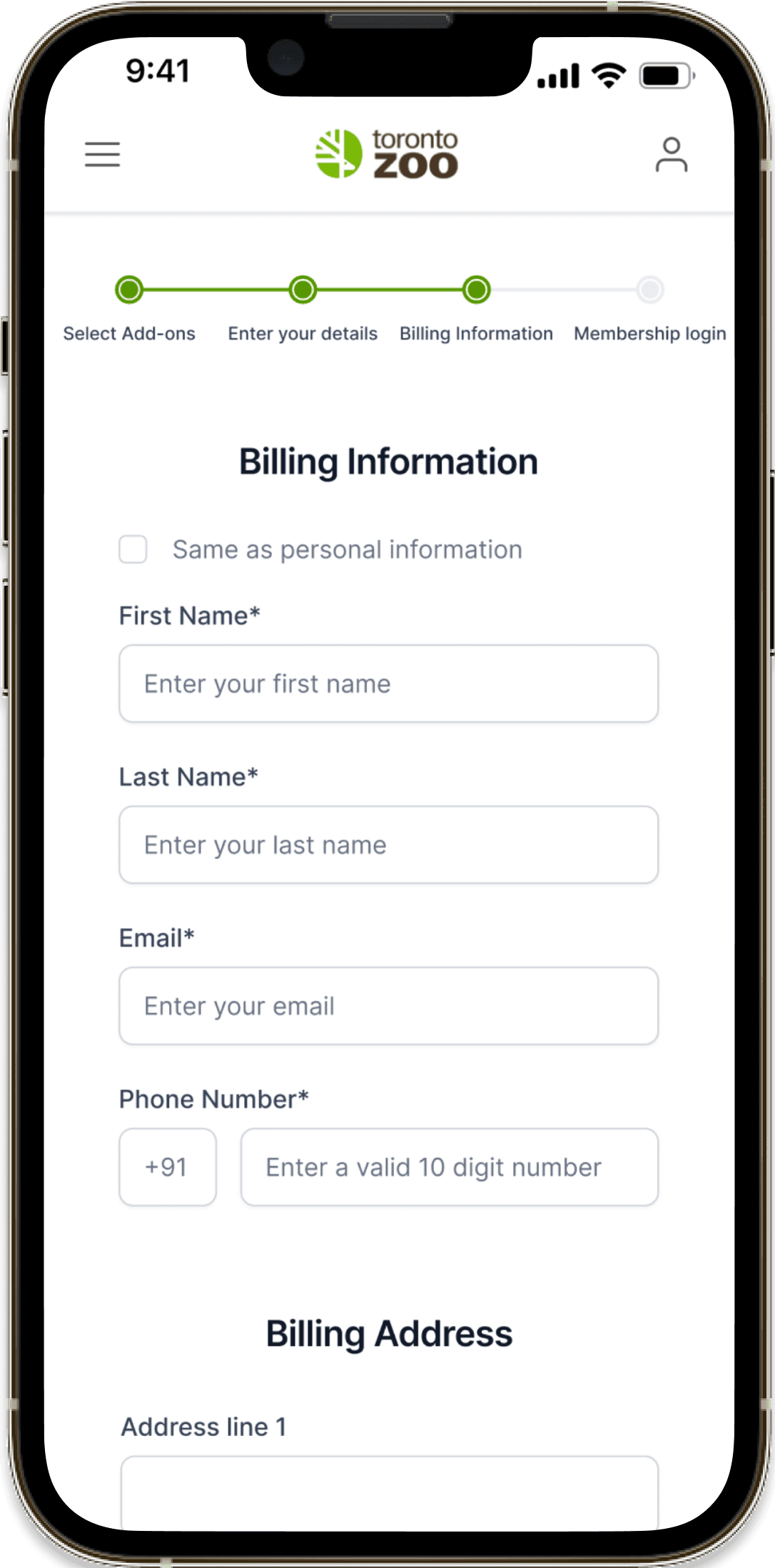
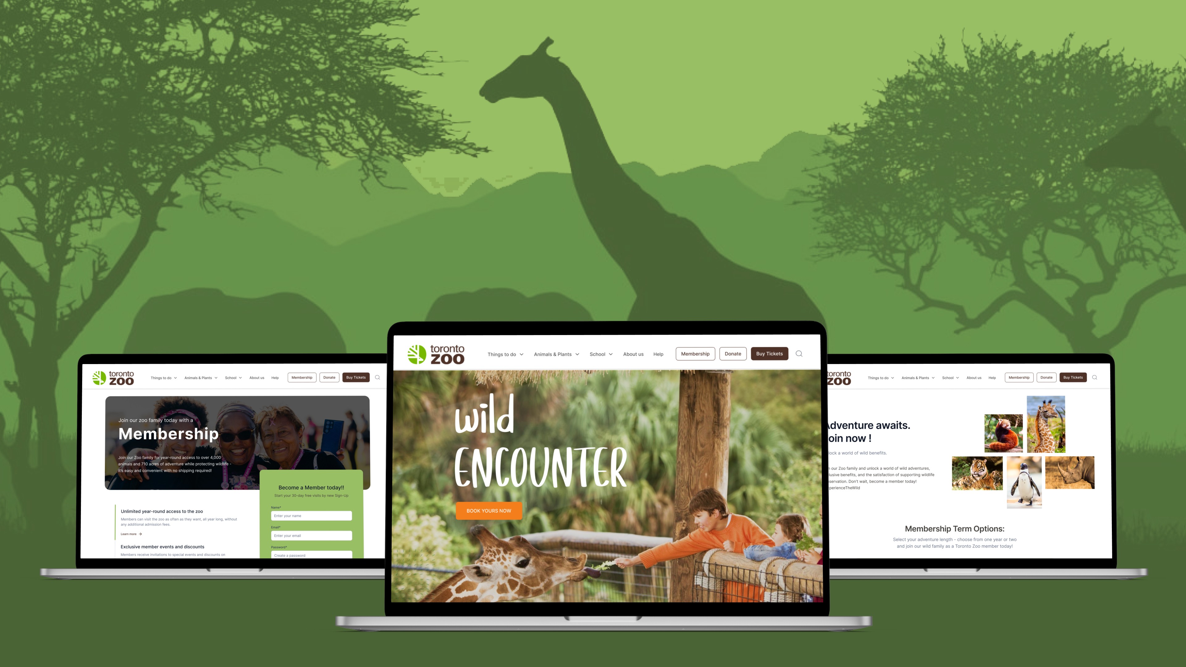
The prototype is clickable and can be expanded for an enhanced experience with the high-fidelity version on mobile devices.
The prototype is clickable and can be expanded for an enhanced experience with the high-fidelity version on mobile devices.
Clickable prototype & can be enlarged for better experience of Mobile high-fidelity prototype
Clickable prototype & can be enlarged for better experience of Mobile high-fidelity prototype
The prototype is clickable and can be expanded for an enhanced experience with the high-fidelity version on Desktop devices.
The prototype is clickable and can be expanded for an enhanced experience with the high-fidelity version on Desktop devices.
Creating visual design
To visually communicate all facets of the Toronto Zoo, including its product, marketing, and broader aspects, it was essential to establish a foundational design system. This system identified key elements of the visual vocabulary, ensuring that the visual design of the Toronto Zoo always reflected its core mission of connecting users with nature.
The primary use of brown palettes on screens provided a sense of stability, support, and protection, while green represented nature, trees, freshness, and fertility.
Employing simple button states and clear iconography which is Inter aimed to make tasks feel more manageable, while the use of a single, modern sans-serif font with wide, open counters ensured legibility and clarity in messaging.
Inter
Ag
ABCDEFGHIJKLMNOPQRSTUVWXYZ
abcdefghijklmnopqrstuvwxyz
0123456789 !@#$%^&*()
Visually articulating all potential aspects of theToronto Zoo (product, marketing, and beyond) meant defining a baseline design system that identified key elements of its visual vocabulary. I wanted Toronto Zoo's visual design to always refer back to its core mission of empowering its users with nature.
Predominantly Brown palettes imbued screens with stability, support, and protection, and green represents nature, trees, freshness, and fertility.
Simple button states and clear iconography would make chores feel more achievable, while a single, modern sans-serif with wide, open counters would assure legibility and clarity in messaging.
Inter
Ag
ABCDEFGHIJKLMNOPQRSTUVWXYZ
abcdefghijklmnopqrstuvwxyz
0123456789 !@#$%^&*()
Cr
Primary
#713B12
Brown
#99BF64
Green
Secondary
#F37E1C
Orange
#EFF5E6
Light White
Base
#000000
Black
#FFFFFF
White
Revealing new short coming through High-Fidelity Prototype testing
Revealing new short coming through High-Fidelity Prototype testing
Due to time constraints, I opted to forego wireframe testing and proceeded directly to developing a high-fidelity prototype. My objective was to address specific points of friction with thoughtful design and ensure consistency in design patterns. I made sure that the methods I employed were straightforward and cohesive with the overall user experience.
Potential usability enhancements included:
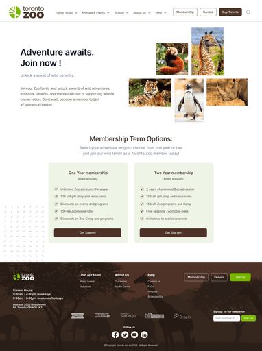
In response to the observation that most users were dropping off during the membership sign-up process, I repositioned the "Join Now" page after selecting the type of membership to purchase. This adjustment aimed to address users' inquiries about how to join without seeing the membership details upfront.
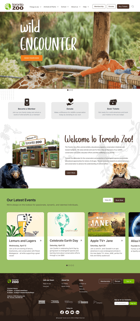
Recognizing users' concerns about staying informed about Toronto Zoo activities, I added information about the zoo on the main page to provide vital updates.
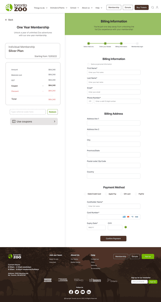
To accommodate users who were hesitant to input their payment information, I incorporated additional payment alternatives such as Apple Pay and PayPal throughout the checkout process.
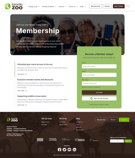
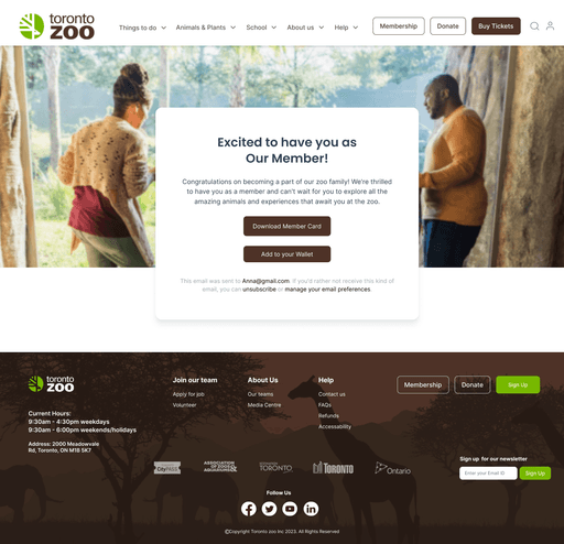
Upon completing the payment, customers are presented with options to download the receipt. However, users requested an alternative method for adding the membership. As a solution, I included the "Add to Wallet" option, enabling users to store their membership details in their digital wallet.
Due to time constraints, I opted to forego wireframe testing and proceeded directly to developing a high-fidelity prototype. My objective was to address specific points of friction with thoughtful design and ensure consistency in design patterns. I made sure that the methods I employed were straightforward and cohesive with the overall user experience.
Potential usability enhancements included:
In response to the observation that most users were dropping off during the membership sign-up process, I repositioned the "Join Now" page after selecting the type of membership to purchase. This adjustment aimed to address users' inquiries about how to join without seeing the membership details upfront.
Recognizing users' concerns about staying informed about Toronto Zoo activities, I added information about the zoo on the main page to provide vital updates.
To accommodate users who were hesitant to input their payment information, I incorporated additional payment alternatives such as Apple Pay and PayPal throughout the checkout process.
Upon completing the payment, customers are presented with options to download the receipt. However, users requested an alternative method for adding the membership. As a solution, I included the "Add to Wallet" option, enabling users to store their membership details in their digital wallet.
Creating visual design
Visually articulating all potential aspects of theToronto Zoo (product, marketing, and beyond)meant defining a baseline design system that identified key elements of its visual vocabulary. I wanted Toronto Zoo's visual design to always refer back to its core mission of empowering its users with nature.
Predominantly Brown palettes imbued screens with stability, support, and protection, and green represents nature, trees, freshness, and fertility.
Simple button states and clear iconography would make chores feel more achievable, while a single, modern sans-serif with wide, open counters would assure legibility and clarity in messaging.
Inter
Ag
ABCDEFGHIJKLMNOPQRSTUVWXYZ
abcdefghijklmnopqrstuvwxyz
0123456789 !@#$%^&*()
The prototype is clickable and can be expanded for an enhanced experience with the high-fidelity version on mobile devices.
The prototype is clickable and can be expanded for an enhanced experience with the high-fidelity version on mobile devices.
Clickable prototype & can be enlarged for better experience of Web high-fidelity prototype
The prototype is clickable and can be expanded for an enhanced experience with the high-fidelity version on Desktop devices.
The prototype is clickable and can be expanded for an enhanced experience with the high-fidelity version on Desktop devices.
Clickable prototype & can be enlarged for better experience of mobile high-fidelity prototype
Lesson Learned
Lesson Learned
By analyzing user feedback and conducting usability testing, I identified areas of improvement and potential enhancements. The key takeaway is the importance of prioritizing user preferences and desires to create a more intuitive and user-friendly interface.
Redesigning the membership purchasing process taught me the significance of simplifying the purchase journey, eliminating unnecessary steps or information overload, and offering a smoother experience.
Reorganizing the navigation highlighted the importance of ensuring that the new navigation system is intuitive, user-friendly, and aligns with the expectations of the target audience.
TIME
Duration: 8 weeks
PLATFORM
Figma
Miro
Photoshop
MY ROLES
UI/UX Designer
Visual Designer
DELIVERABLES
High-fidelity interactive prototypes for key tasks on desktop and mobile
TIME
8 weeks
PLATFORM
Figma
Miro
Photoshop
MY ROLES
UI/UX Designer
Visual Designer
DELIVERABLES
High-fidelity interactive for desktop and mobile
TIME
8 weeks
PLATFORM
Figma
Miro
Photoshop
MY ROLES
UI/UX Designer
Visual Designer
DELIVERABLES
High-fidelity interactive for desktop and mobile
Background
The Toronto Zoo has been a staple institution in the city since it first opened its doors in 1974. Visitors of the zoo have a unique opportunity to observe and connect with animals from all over the world, and the zoo’s conservation and sustainability initiatives are invaluable to the wildlife preservation community as a whole
Other Case studies
Speedy Eats
Redesign of Humber Current
StylishYou

Vosyn (Coming Soon)
Speedy Eats
Redesign of Humber Current
StylishYou
Vosyn (Coming Soon)
Speedy Eats
Redesign of Humber Current
StylishYou
Vosyn (Coming Soon)
Speedy Eats
Redesign of Humber Current
StylishYou
Vosyn (Coming Soon)
Speedy Eats
Redesign of Humber Current
StylishYou
Vosyn (Coming Soon)
Primary
#713B12
Brown
#99BF64
Green
Secondary
#F37E1C
Orange
#EFF5E6
Light White
Base
#000000
Black
#FFFFFF
White
Primary
#713B12
Brown
#99BF64
Green
Secondary
#F37E1C
Orange
#EFF5E6
Light White
Base
#000000
Black
#FFFFFF
White
jgrth3@gmail.com
Copyright © 2023 Jagruthi Venkatesh Naidu. All rights reserved.
jgrth3@gmail.com
Copyright © 2023 Jagruthi Venkatesh Naidu. All rights reserved.
jgrth3@gmail.com
Copyright © 2023 Jagruthi Venkatesh Naidu. All rights reserved.